
How to Plan a Blue and White Mobile Phone Store Design Layout

When you step into the competitive world of smartphone retail, your store’s interior design is the very first impression you make on your customer. It is not just a place to hold inventory; it is a stage for your products. In this case study, we will walk through how to plan a high-impact mobile phone store design using a bold blue and white aesthetic, based on a highly successful retail layout we recently executed.
Whether you are planning a brand-new flagship store, renovating an outdated kiosk, or expanding your electronics retail chain, this guide will walk you through the planning, zoning, and material selection process. Let’s dive into how you can create a layout that boosts foot traffic and maximizes sales.
1. Defining the Visual Identity: Why Blue and White?
The choice of colors in your store is much more than decorative; it is psychological. Looking at the images provided, we leveraged a classic, high-contrast blue and white theme.
- Blue represents trust, technology, and reliability—core values for any electronics brand.
- White brings cleanliness, premium quality, and a sense of openness.
- The Mix: When you combine royal blue with pristine white surfaces, it immediately screams “high-tech” and “modern.” This specific palette reduces visual clutter and ensures that the colorful smartphone screens become the focal point of the customer’s eyes.
By integrating custom LED lighting into the blue accents, we also create a futuristic, glowing effect that appeals to younger, tech-savvy consumers.
2. Planning the Floor Plan: The Open-Center Layout
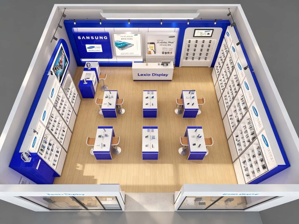
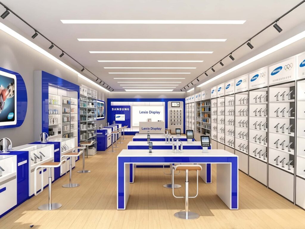
A common mistake in phone store design is crowding the entrance with large counters. In this layout, we adopted an open-center island design. If you look at the bird’s-eye view in the images, you’ll notice the walking path is clear and unobstructed.
- The Entryway: We placed a sleek, low-profile reception desk immediately at the entrance or slightly to the side (as seen in the images with the “Lexio Display” branding). This acts as an anchor without blocking the view into the back of the store.
- The Aisle Width: We left substantial walking space between the central islands and the wall displays. Ideally, 1.2 to 1.5 meters of clear space allows two customers to pass comfortably without touching shoulders, reducing the “crowded” feeling that drives customers away.
- The Rear Wall: We established a distinct focal wall at the back. This draws customers deeper into the store, ensuring they walk past the promotional displays positioned in the middle.
3. Zoning Your Store for Maximum Efficiency
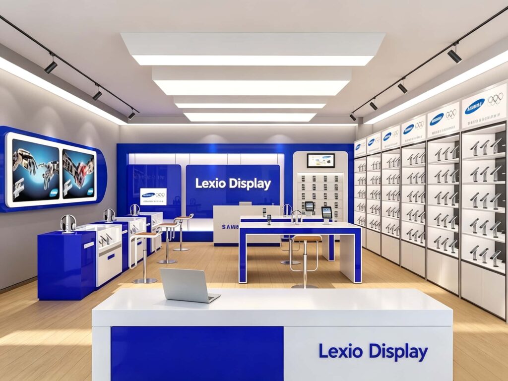
To handle various customer needs, we separated the store into logical “zones.” Here is the breakdown of the layout used in this project:
| Zone | Function | Design Element Used |
|---|---|---|
| Central Experience Zone | Primary product display; hands-on testing area. | Modular white tables with blue panel edges, raised phone stands, and adjustable ergonomic bar stools. |
| Wall Display Area | Passive product showcase; quick browsing. | Floor-to-ceiling grid shelving system. Clean white back panels with vertical LED strip lights. |
| Service & Checkout Zone | Payment processing and service assistance. | Rear counter with visible branding. Includes a height-adjustable service area for customer comfort. |
| Accessory Wall | Add-on sales (covers, chargers, headphones). | Dedicated glass or acrylic cabinets integrated into the wall shelving system. |
| Digital Brand Wall | Brand storytelling and promotional campaigns. | A large, illuminated digital screen embedded into a glowing blue 3D panel, ensuring high brand recall. |
4. Selecting the Right Materials and Fixtures
Durability is a key concern for any phone store owner. Customers handle devices constantly; tables and chairs will get scratched. For this design, we utilized high-grade materials that balance aesthetics with longevity:
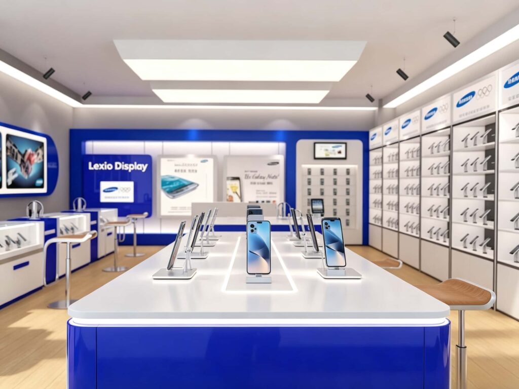
- Table Surfaces: We chose a premium, smooth matte-white solid surface or high-pressure laminate. This isn’t just easy to clean; it also prevents the heavy reflections that often make phone cameras look distorted under store lights.
- Blue Edging: We used high-gloss blue acrylic (often called “blue mirror” finish) for the table borders and wall frames. This catches the light beautifully, making the store look expensive and bold.
- Flooring: Instead of cold tiles, we used light oak wood laminate flooring. This brings a surprising warmth to the blue-and-white palette, making customers feel comfortable enough to stay and browse.
- Hardware: Stainless steel legs and high-quality chrome fixtures ensure that the bar stools and stands remain rust-free, even in high-humidity environments.
5. Mastering the Lighting Plan
If you want to sell premium phones, the lighting needs to be pixel-perfect. In this project, we used a three-tier lighting system:
- Ambient Lighting: Large, uniform square LED panels are recessed into the ceiling. This provides a bright, shadow-free environment that gives the store a clean, healthcare-like professional feel.
- Accent Lighting: Black track lighting rails are suspended above the shelves. We can rotate these spotlights to illuminate specific newly released phones or highlight a premium model on the back wall. Track lighting gives us the flexibility to change promotional layouts without rewiring the whole store.
- Task & Decorative Lighting: We embedded luminous LED strips into the edges of the blue display tables. This creates a “floating” effect and draws attention to the phones placed centrally. This also provides a soft glow that helps customers see the phone’s screen clearly even from a distance.
6. Branding and Visual Merchandising
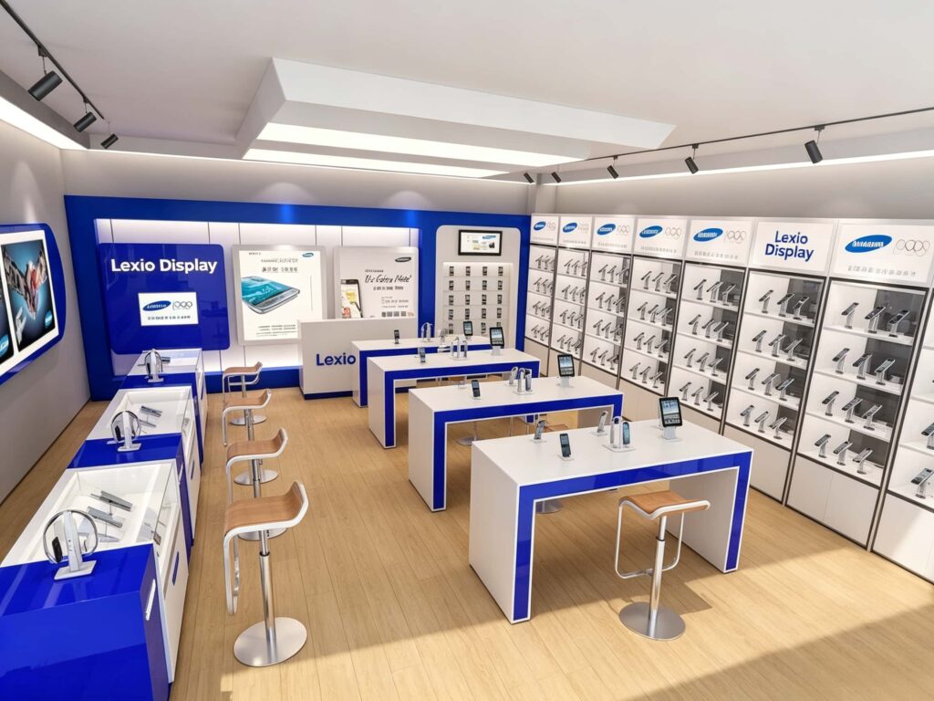
A phone store is an extension of the brand you carry (like Samsung, Apple, or generic multi-brands). In our example, the branding for “Lexio Display” is seamlessly integrated into the store’s structure. Notice how the logo appears on the back wall, on the reception counter, and inside the wall header boards.
We used high-contrast white-on-blue text panels which are highly readable from a distance. Additionally, placing the promotional posters right at eye level on the back wall guides the customer’s gaze toward the latest offerings immediately upon entering.
FAQ: Common Questions About Phone Store Layouts
Q: How much does a custom blue-and-white phone store layout cost?
A: The cost varies based on the square footage, materials selected (e.g., high-gloss acrylic vs. standard laminate), and the complexity of the lighting system. However, we work with a global supply chain that reduces manufacturing costs, allowing us to offer premium fit-outs at competitive wholesale prices.
Q: What is the ideal counter height for a phone store?
A: For the central experience tables, a height of 1.05 meters to 1.1 meters is standard. This is high enough for customers to stand and browse comfortably, but low enough for a staff member to lean over and help without bending awkwardly. Bar stools sit at 75cm height to match.
Q: How do I keep the white surfaces clean over time?
A: We recommend a matte finish or “anti-fingerprint” laminate for the white surfaces. Dark blue edges help hide wear and tear. We also recommend regular cleaning with a mild, non-abrasive glass cleaner to keep the glossy blue acrylic panels looking sharp.
Q: Can I order just the display cabinets without the full store design?
A: Absolutely. We offer modular, custom display cabinets and kiosks separately. However, we strongly recommend a holistic design service for first-time store owners to ensure the shelving, lighting, and tables work in perfect harmony.
Ready to Bring Your Ideal Store to Life?
Designing a mobile phone store is about balancing aesthetics with practical functionality. The blue-and-white concept we showcased here is just one example of how strategic layout planning can transform a simple room into a powerful sales engine. It enhances brand authority, organizes customer movement, and beautifully highlights your merchandise.
If you are planning to open a new electronics store, upgrade your existing kiosk, or need high-quality retail display cabinets manufactured to global standards, we are here to help.
Don’t leave your retail success to chance.
Get in touch with our design team today. We will work with you to create a 3D rendering of your custom store layout, source the best materials to fit your budget, and manufacture the display cabinets and furniture to exact specifications—shipping directly to your location worldwide.
Click here to request a free initial consultation and quote for your mobile phone store design and custom fittings today! Let’s make your store the most talked-about shop in your city.