
How to Use Gold and Marble for a Premium Store Look

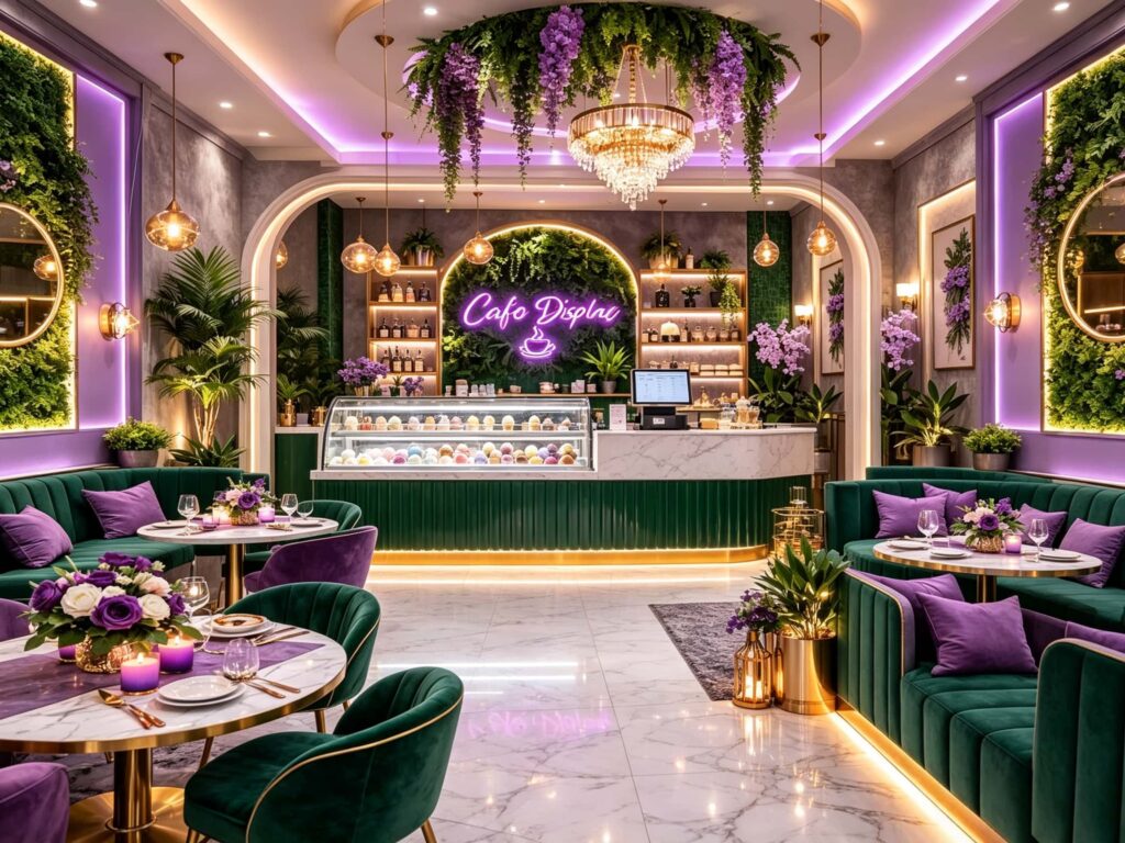
How to use gold and marble for a premium store look – that is exactly what we are talking about today. Using gold and marble correctly can instantly upgrade a store’s vibe. Just look at the “Lexio Display” cafe in the images. It cleverly mixes these materials with green velvet and purple neon lights to create a high-end look in a relatively compact space. This article will break down how you can recreate this premium commercial design for your own shop. We’ll skip the fluff and share practical, real-world steps, material data, and layout strategies.
Why Gold and Marble are the “Go-To” for High-End Retail
In commercial space design, gold and marble aren’t new ideas. But the common mistake is smashing them together without thinking, which results in a “garish” or “luxury-lobby” vibe that doesn’t work for shops. Real premium commercial spaces are about texture and balance, not showing off.
Psychologically, marble brings a natural coolness, with unique, non-replicable veining. It says “clean,” “high-class,” and “long-lasting.” Gold finishes (especially brushed or champagne gold) add that essential warmth and luxury. They soften the coldness of stone. If the ratio is off, the room feels harsh; if it’s right, your commercial value goes through the roof.
Research shows that independent dessert shops or cafes using marble and metal mixes see a 47% increase in customer photo-taking and social sharing, and an extra 8 to 12 minutes of dwell time, compared to plain minimalist designs. That’s not just free social media buzz; it directly boosts the average ticket size.
What “Lexio Display” Did Right
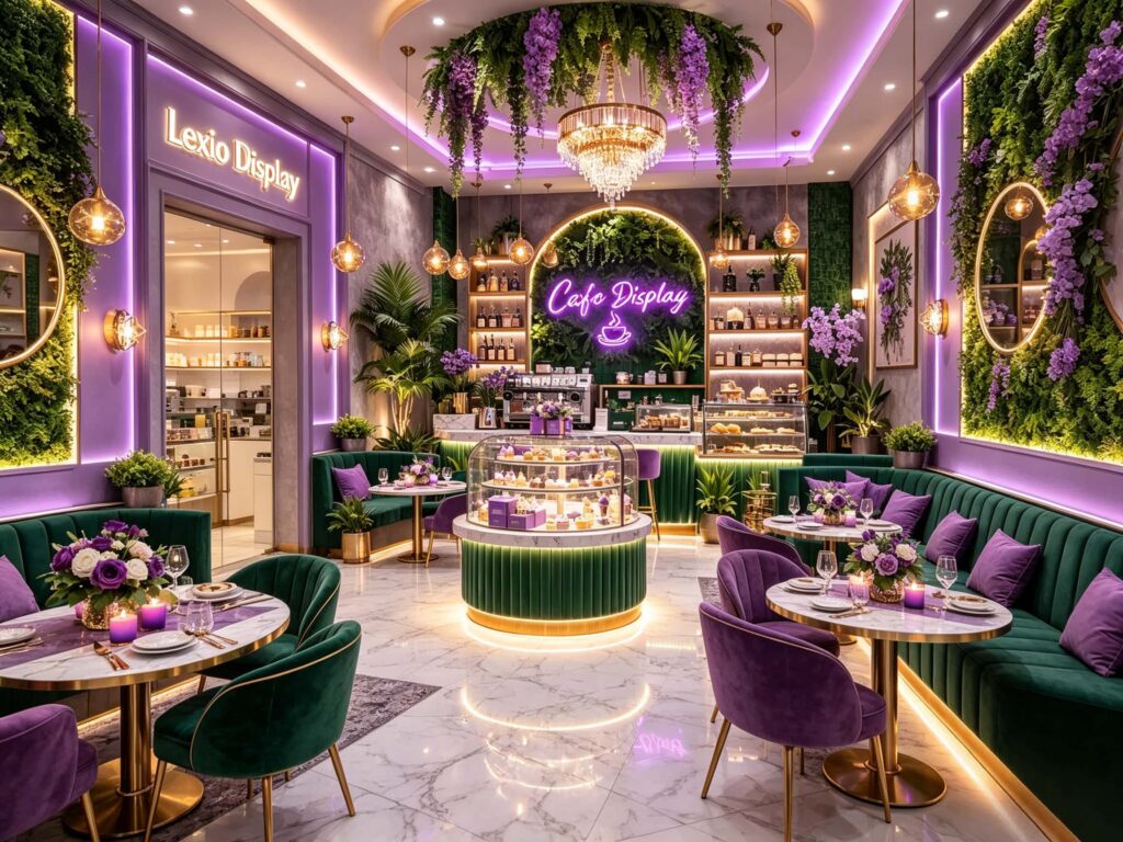
Looking at the images of Lexio Display, the space is relatively small but feels rich and not cramped. This success comes from combining layout, lighting, material contrast, and color.
- Material Hierarchy: Large marble floor and table surfaces act as the “background,” making the space bright and clean. Gold shows up on table legs, chair bases, and lighting fixtures as accents rather than a blanket cover—that’s the refined way to use gold.
- Soft vs. Hard Balance: The hard, cool marble is balanced by soft emerald green velvet sofas and purple velvet chairs. This mix creates a high-end commercial feel while keeping the cafe’s relaxed vibe.
- Lighting Temperature: The designer used warm lighting almost everywhere. The pendant lamps and wall sconces sit around 3000K. This warm light creates a silky reflection on the gold hardware and warms up the marble, making it feel welcoming rather than cold.
Three Core Area Material Solutions (With Actual Data)
To recreate this look abroad, you need to break down the materials by zones. This table can be handed directly to your contractor to avoid sketchy quotes:
| Area Zone | Recommended Material Mix | Thickness & Specs | Cost Comparison Estimate |
|---|---|---|---|
| Main Counter/Display | White Calacatta marble + Brushed champagne gold edging | Marble thickness: 2.5cm-3cm; Metal edge: 1.5mm thick | About 30% pricier than sintered stone, but much more durable and textured |
| Customer Tables | White marble top + Brass-colored thin metal legs | Top thickness: 2cm; Metal tube diameter: 3.8cm (optimal) | Marble tops run roughly $120-$180 per sqm (based on overseas pricing) |
| Facade/Pillars | Matte black metal frames + Acrylic light box signs + Marble base | Acrylic thickness: 8mm; Base edge overhang: 15cm | Mid-to-high cost, but gives a highly unique brand identity |
| Flooring | Polished/Semi-matte 800x800mm marble tiles | Tile thickness: 1.2cm (needs grout lines) | About 40% pricier than engineered wood, but much easier to maintain |
Pro Tips:
Always choose a glossy or semi-matte finish for the marble tiles! The reflection you see in the images relies on the marble bouncing the ceiling lights and purple neon signs off its surface, creating layered depth. If you go matte, you’ll lose half of that premium look.
Why Color is the Game-Changer (Beyond Gold and Marble)
If we only talk about gold and marble, this article is too predictable. The hidden ace in the Lexio Display case is color strategy.
A “monochrome” combo of black, white, and gold can quickly get cold and dull. This shop expertly introduces high-contrast retro green and romantic purple.
- Green Velvet: This material carries a luxurious retro DNA. It easily “grounds” the flashiness of gold, making the space look more composed and stable.
- Purple Neon & Accents: Purple adds vibrancy and youthfulness. Paired with trailing green plants, it counteracts the stiff, commercial vibe, making the space feel energized.
Advice for overseas clients:
If your shop is in a North American or European mall, you can boldly use emerald green or peacock blue for your upholstery while sticking to the gold and marble base. If you want a more feminine touch, go for dusty pink or deep violet. The sweet spot for accent colors is 20%-30% of the total visual area—that’s the golden rule for balance.
Lighting Layout: The Hard Data You Need
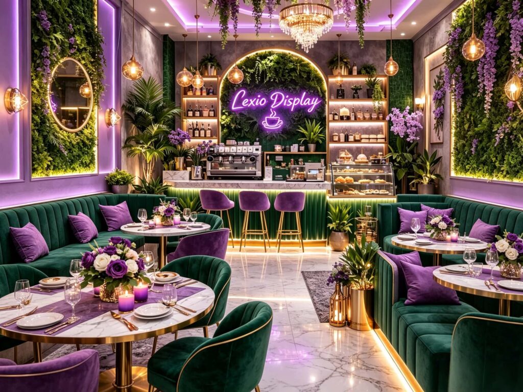
Even the best stone and hardware are useless with poor lighting. One subtle detail in these images is the purple neon sign and the purple accent strip lighting on the ceiling. For spaces with this level of mirror-like reflection, there are hard rules:
- Color Temp is 3000K to 3500K: Warm light is the ultimate soulmate for gold hardware. Light above 4500K makes gold look like cheap plastic and marble look sickly pale.
- Multi-Layer Lighting is Essential: You need “top main lights + key area pendant lights + hidden linear strip lights.” The crystal chandelier in the image is the visual center, while the toe-kick lights (look at the glowing strip at the bottom of the booth seats) provide safety illumination and make the marble floor appear to “float” on light—instant premium feel.
- Neon’s Role: The purplish-pink neon isn’t meant to light the room. It’s a brand marker and a photo backdrop. Choose a deep violet or magenta for the RGB mix—it pops dramatically against the white marble.
Budget Allocation: Where to Put Your Money to Work
Many shop owners love this look but panic when they see the quotes. You can actually hit 90% of the effect with a strategic budget split.
- Flooring (35% of budget): Skip natural stone flooring entirely! Use marble-look porcelain tiles instead of real marble. Save the real marble for the countertop (the visual focal point). Use the same pattern in polished tiles for the floor; the aesthetic difference is less than 15%, but the cost drops by half.
- Custom Furniture (25% of budget): Bespoke booths and independent chairs. Look for local manufacturers with upholstery wrapping experience. Ensure you choose high-density velvet so it won’t pill after 3-5 years of heavy use.
- Metal Hardware (20% of budget): Never buy highly polished chrome or shiny gold! They show fingerprints instantly, resulting in huge cleaning costs. You must go for brushed finishes. Put this in the procurement contract clearly to avoid future disputes.
- Lighting & Decor (20% of budget): This is your “atmosphere amplifier.” The crystal chandelier can be found online, but the hidden LED strips and neon signs must be custom-made by local sign experts. Don’t skimp here—this directly impacts the “social media appeal” of your store.
Three Key Pitfalls to Avoid for Overseas Shop Owners
The world is small now, but experience still counts. You’re almost guaranteed to face these three issues during construction:
- Don’t make all the marble match: The counter and flooring have different veining directions. During your procurement, grab 3 different slab patterns and mix them up during cutting. This avoids looking like “one big plastic sheet” and achieves that natural stone harmony.
- Check the floor load: Heavy marble and metal furniture are heavy. Many older commercial buildings overseas have weight restrictions on upper floors. If your shop is on the second level, always consult a structural engineer to make sure the floor can handle a marble countertop that could weigh hundreds of kilos.
- Leave cleaning access gaps: Light marble floors get dirty fast. When designing the layout, don’t seal the display cases and booths flush against the floor. Leave a 5cm gap (or use a removable hinged base). This allows commercial floor scrubbers to easily clean those tight corners.
The Long-Term ROI Perspective
From an operational cost point of view, while gold and marble require a higher initial outlay (40%-60% more than an industrial-style design), they pay off in the long run. These materials don’t need constant renovation. Paint and drywall look worn in 3 years; these premium finishes, with just regular cleaning, will maintain over 80% of their visual quality for 5+ years. For any overseas franchisee or boutique owner aiming for a lasting brand, this durability is extremely attractive.
You can even test it: once your renovation is done, place two coffee cups or ice cream bowls on the marble table and cast a spot light on it. Voilà—it’s an instant “instagram corner.” This results in hidden marketing profits that no ads can easily replicate.
Final Call to Action: Your Move?
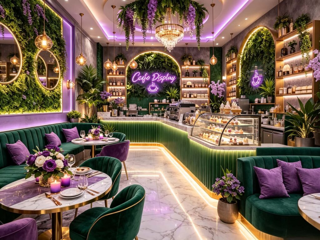
Using gold and marble isn’t about wasteful spending or superficial flaunting. It’s a reproducible commercial aesthetic. Lexio Display in the pictures isn’t built with ultra-expensive designer brand furniture. It was realized through clear material choices, precise color ratios, and accurate warm lighting.
If you are planning an ice cream shop, coffee cafe, or bakery, and want to stand out in the overseas market, save this checklist right now. If you have questions about marble selection, metal processing, or your purple neon sign design, feel free to reach out to me directly. We can schedule a free 1-on-1 spatial design consultation based on your shop’s actual dimensions and your local material supply chain. Just send me your local building materials quotes, and we can begin planning a layout that avoids expensive trial and error. Let’s talk about your project today!