
Island Counters for Modern Perfume Stores

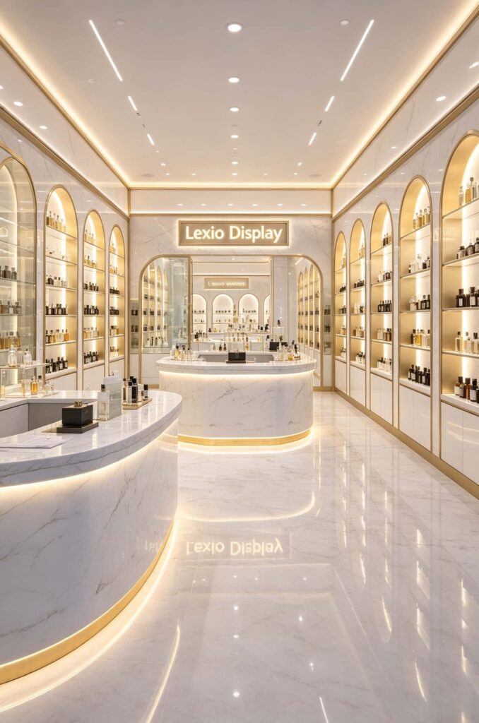
If you’re looking for display solutions for modern perfume stores, Island Counters for Modern Perfume Stores are absolutely the most worthwhile investment you can make for the whole shop. Look at these actual images from Lexio Display. The white marble center island with its glowing base is the absolute soul of the store’s flow. When we nail this area down, the likelihood of customers stopping to browse at least doubles when they step in. Let’s skip the marketing fluff and just break down the design and implementation details based on this store’s structural setup.
Why Modern Perfume Stores Must Have Island Counters?
A lot of boutique owners have a common issue: they cram products onto the wall shelves and leave the central aisle empty. That’s basically wasting the most valuable selling area in your shop.
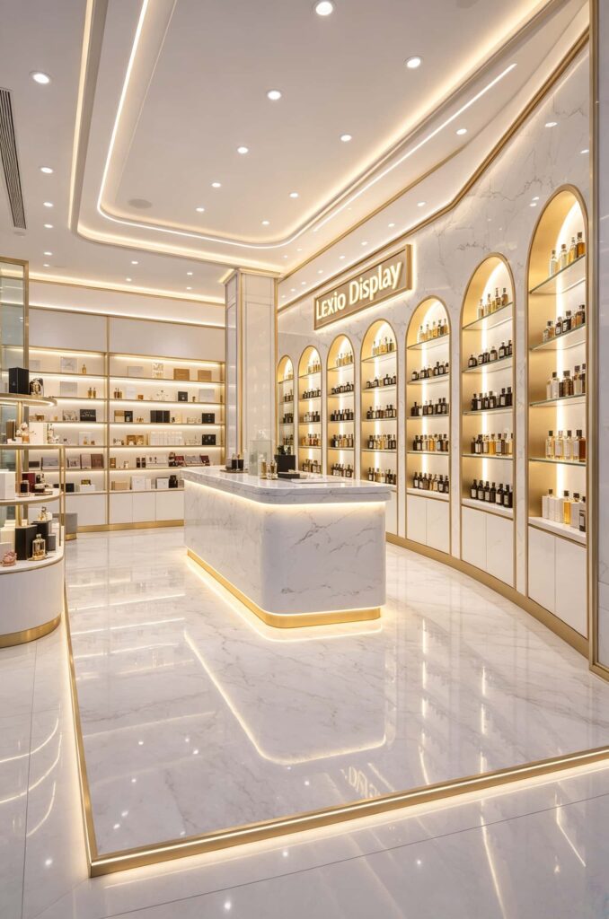
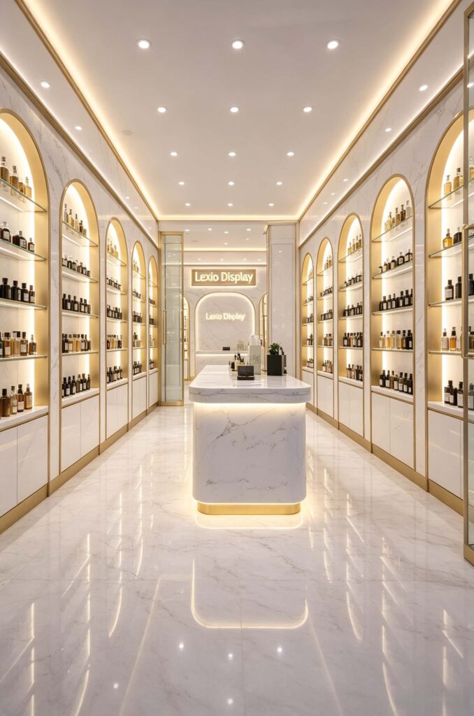
Look at the logic of this store in the images. The arched wall niches handle the “variety and breadth” of the whole brand range, while the curved island counter right in the center is dedicated to the “refinement and beauty.”
The island serves three core roles:
- Flow guidance: It acts like a magnet, pulling customers straight from the entrance into the heart of the store.
- Interactive testing: Perfume is 100% an experience-based product. Putting bestsellers and new arrivals right on the island surface, within arm’s reach, breaks down the barrier.
- Price anchoring: By placing your high-margin, promoted items prominently on the island, you catch immediate attention.
Here’s a practical table to give you a clear comparison of what each section of the store should actually achieve.
| Store Display Area | Functional Purpose | Product Types Ideal For | Impact on Revenue |
|---|---|---|---|
| Floor-to-Ceiling Arched Shelves | Brand endorsement and category abundance | Full brand lineups, classic mainstream perfumes | Builds overall brand image, offers massive variety |
| Central Curved Island Counter | Core conversion zone, visual focal point, testing area | High-margin bestsellers, season’s new launches, travel samples | Directly increases average ticket size and conversion |
| Checkout & Enclosed Experience Zone | Drive impulsive add-ons, handle inquiries | Mystery boxes, small skincare samples, fragrance hand creams | Boosts add-on sales, improves repeat customer rates |
Case Study Breakdown – The White Marble + Gold Trim Display System
Let’s physically break down these actual images, layer by layer. This design isn’t just about picking white and yellow. There are a ton of smart, targeted details hidden behind it.
The Arched Niches are the visual highlight.
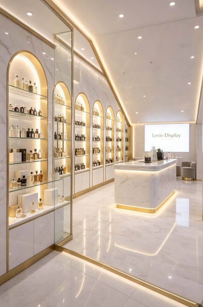
Look at the walls in the photos. The designer didn’t use standard square shelves. They used arched niches with rounded tops. This mirrors the display windows you see in high-end European boutiques. This shape breaks up the rigid straight lines of a regular space. It feels incredibly soft and very feminine—which is a huge plus since the core demographic for perfumes is women.
Inside each arch, there is a metal frame border, and the top part hides a light source. When the light hits, the perfume bottles inside look like little artworks on display.
The glowing base on the island counter.
One of the most eye-catching elements in these photos is the base of the center island.
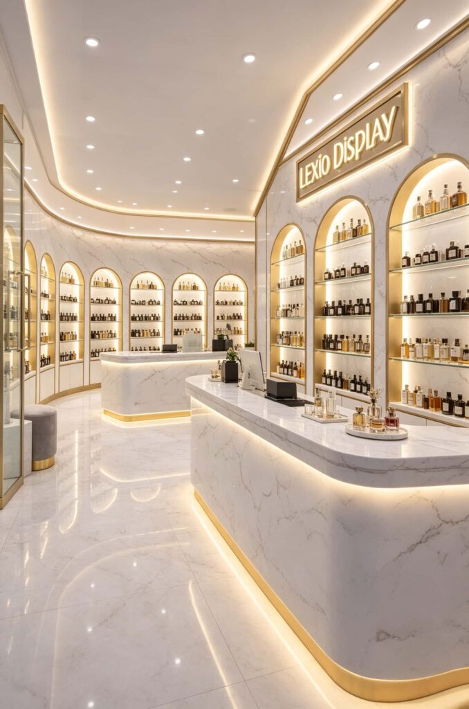
The curved white marble top doesn’t touch the floor directly. Instead, it’s suspended, with a hidden LED strip wrapped around a gold-toned metal base. This trick is genius. It gives the heavy marble cabinet a “floating” feel that looks incredibly lightweight. Plus, that bottom glow not only adds shine to the floor but naturally draws the customer’s eyes upward toward the products on the top.
The materials are solid.
Look closer at that white island and the walls. It’s not cheap white painted wood. It’s white marble (or high-quality sintered stone) with faint grey veins. Marble reflects light beautifully. It’s sophisticated, and when warm lighting hits it, the gradients of shadow are very soft and organic.
The gold used isn’t a shiny, polished gold either. It’s brushed brass or champagne gold. Shiny gold just looks gaudy under the spotlights. This brushed, matte gold looks restrained, classy, and luxurious.
Lighting Details for the Island Counter (Don’t just look at the skin)
Many stores copy beautiful pictures from the internet, but they end up looking like the “buyer’s show” version. This is almost always because they botched the lighting.
Let’s look at the lighting codes in these pictures and put them into a table, so you can just hand it to your construction team.
| Lighting Placement | Suggested Color Temperature | Suggested CRI (Color Rendering Index) | Hiding Method | Visual Effect Created |
|---|---|---|---|---|
| Inside the Arched Niches | 3000K – 3500K (Warm yellow-white) | CRI ≥ 95 | Hidden at the top edge inside the arch | Creates a museum display feel; makes glass bottles glow |
| Island Toe-Kick Base | 2700K – 3000K (Warm, cozy yellow) | CRI ≥ 90 | Hidden inside the metal trim strip | Creates floating effect; adds depth to the floor |
| Ceiling Wall-Washers | 4000K (Neutral white) | CRI ≥ 90 | Embedded track lights in the recessed ceilings | Uniform ambient light; creates reflections on the floor |
| Underneath Product Shelves | 3500K | CRI ≥ 95 | Hidden under ultra-clear glass shelf edges | Makes the perfume liquid look crystal clear and premium |
Here’s a piece of straight talk: perfume is the most sensitive to color rendering. If you buy cheap LED strips that make colors look grey, even the most expensive perfume will look like cheap water on the shelf. When we build these high-end fragrance cabinets, we always demand a CRI of over 95 for all light strips. That’s the absolute baseline. Do not save money here.
The High-Gloss Reflective Floor – A Secret Space-Enlarger Most People Miss
Pay attention to the floor in Figure 1 and Figure 6.
It’s not matte, and it’s not just standard polished tiles. It’s a highly polished, ultra-reflective white large-format slab.
Why am I making a big deal about this? Because when your shop has arched niches and glowing islands, if the floor is dark and dull, the whole bottom part of your space feels heavy. But with this reflective flooring, the ceiling track lights, the base lights from the islands, and the warm lights from the niches create mirror-like reflections on the ground.
For small perfume stores or shops with lower ceilings, this is a very clever “space-stealing” trick. The reflections from the floor instantly stretch the visual depth. A 40-square-meter shop will feel like a 70-square-meter luxury showroom.
How to Avoid Construction Pitfalls with this White+Gold Design?
Having produced and installed these display cabinets for years, this “white and gold” luxury style is where clients step into the most traps. Here’s a practical guide to dodge the bullets:
- Choose marble patterns carefully. Do not pick intense, high-contrast whites like Snowflake or Fish Maw white. The light, misty, subtle veining shown in the photos is perfect. If the patterns are too heavy or busy, the large wall areas will look cluttered and overwhelming.
- Consider the smudge factor. White counters are fingerprint magnets. If you use standard white wood boards, every customer print will show up immediately. When we manufacture these, we must apply a crystallized coating or an anti-fingerprint film to the surface. How smooth the surface is determines your daily cleaning costs.
- The proportion of the arch niches. The arches in the photos aren’t just picked randomly. They depend entirely on your store’s ceiling height. If the arch is too flat, it looks like a cat door. If it’s too pointed, it looks like Gothic architecture. You need to follow a semi-circle or a large-radius curve to get that soft, round feel.
- The metal trim on the toe-kick. That champagne-gold border in the photos isn’t a pre-made frame stuck on. It’s crafted by the carpenter by creating grooves in the cabinet and inlaying the metal profile seamlessly into the board. This seamless fit requires highly accurate factory work. If you hire a workshop that can’t do custom measurements and precision cutting, do not try to copy this blindly, or the gaps will be horrifyingly big.
How to Actually Drive Sales with This Island Counter Design?
We’ve covered the design. Now let’s address the “how to sell” aspect.
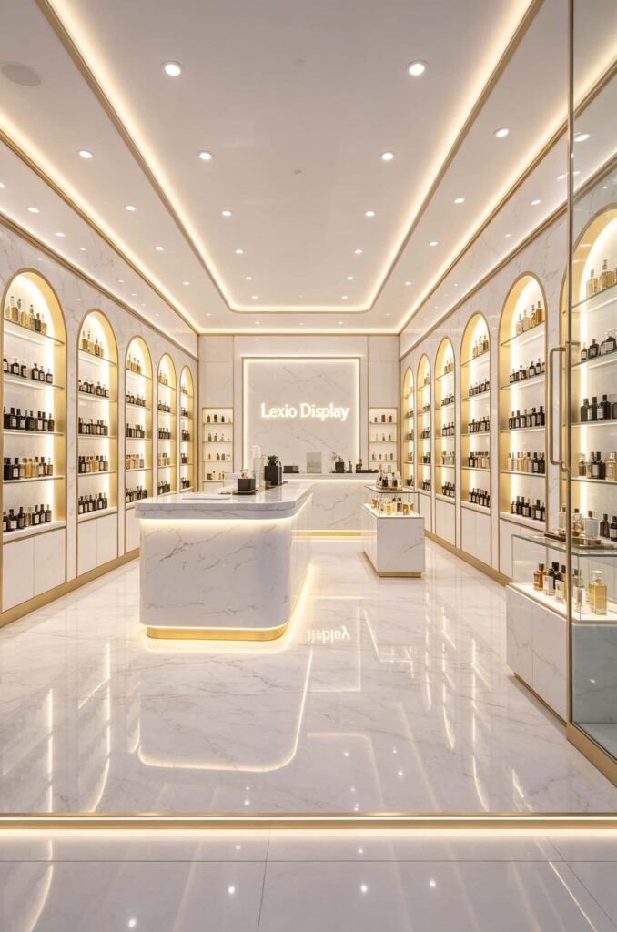
Look at that big curved island in the pictures. It’s entirely designed to facilitate product testing.
- Don’t clutter the island surface. A lot of novices pile the island high with products, which causes “decision paralysis” for customers. This store is very smart—they just place a neat row of tiny bottles or selected featured items on top, leaving plenty of empty counter space. That empty space is for customers to set down their test strips and personal items. A clean surface actually stimulates the desire to buy.
- Merge the checkout function at the end of the flow. Many stores keep the checkout counter separate. But in these pictures, the back end of this island actually links to the checkout and inquiry area. After customers finish testing and head to the register to pay, they still walk past the island display. Right there, the cashier can easily recommend a fragrance hand cream or a small sample, smoothly driving add-on sales.
Your Custom Island Counter and Premium Display Cabinet Services
Alright, let’s bring it back to the bottom line after looking at the case study.
Those beautiful arched niches, the glowing white marble island, and the illuminated brand background wall in the photos aren’t standard items you can buy off the shelf. They are custom-made, one-to-one, tailored to your exact store width, ceiling height, and electrical routing.
We aren’t just a factory that sells cabinets. We are a one-stop service provider offering “Spatial Display Design + Custom Cabinet Production + Global Delivery & Installation.”
If you are currently planning to open a new perfume store, a cosmetics boutique, or if you want to renovate that old, tired-looking shop you’ve run for years.
You don’t have to find carpenters yourself or run around to building material markets. Simply send us your floor plan (including length, width, and height dimensions) and your rough style preferences.
Our design team can provide a preliminary shop layout sketch for free. We can match the high standard shown in these photos—customizing the arched niches and glowing island counters—produce the premium display cabinets, and ship them to your city for final installation. This saves you all the back-and-forth headaches of coordinating different contractors.
If you put the effort into early-stage design communication, the final in-store quality will look as solid as these pictures. If you’re interested in our solutions, feel free to leave a comment below or drop us a private message with your contact info. We’ll have a one-on-one chat and calculate a detailed implementation plan and budget for you.