
How to Plan a Pink Cosmetic Store Design

When planning a pink-themed cosmetics retail store, the core lies in achieving a balance between “attractiveness of appearance” and “conversion rate in-store”. Pink is a classic color in the cosmetics industry, inherently carrying a soft feminine charm, which can quickly capture the attention of the target audience and naturally suits categories such as makeup, skincare, and fragrances. However, many stores end up either having a cheap and rustic texture or looking good in photos but not selling products.
A truly effective pink cosmetics store that can attract customers and boost sales needs to take into account color texture, shopping flow, display efficiency, and brand recognition. In the following section, we will analyze the complete planning concept based on actual physical cases to help you avoid common pitfalls and create a store design with high conversion rates.
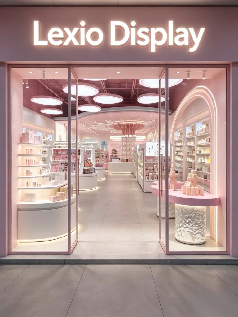
What are the most common pitfalls when designing a pink beauty store?
Many first-time owners of pink beauty stores tend to fall into these 5 typical mistakes. They spend a lot of money but end up with unsatisfactory results and poor sales performance.
- First, the color selection is too bright and cheap-looking. Many people think that the brighter the pink, the more eye-catching it is, so they directly choose highly saturated bright pink. The pictures online look eye-catching, but in reality, the visual impact when entering the store is too strong, and after staying for a while, it is easy to get eye fatigue, which also lowers the brand’s prestige and makes it look like a cheap ten-yuan store.
- Second, the entire store has the same color without any gradation. From beginning to end, the entire store is one shade of pink, without any transition in shades or neutral colors to balance it out. Customers feel suffocated when entering the store and want to leave after just ten minutes of browsing. The retention ability is extremely poor.
- Third, the flow of the store is chaotic and not fully accessible. At the entrance, there is a large central island, and the main passage is narrow, with no logical division of the side cabinets. Customers cannot find the products they want, and after browsing for a while, they will turn around and leave. Most products have no chance to be seen.
- Fourth, the lighting is chosen incorrectly with a large color difference. Just installing a few ordinary cold light bulbs is not enough for the color rendering index. Lipsticks and foundation look like one color in the store, but when exposed to the sun outside, they change. The incorrect color matching leads to many complaints from customers and a very low repeat purchase rate.
- Fifth, only focusing on the appearance level and ignoring practicality. To make the overall appearance look good, storage space is cut off, the makeup testing area is too small, and the cashier counter is hidden in a corner. During peak hours, there is chaos in the checkout line, and it is inconvenient to restock and sort goods. The operational efficiency is very low.
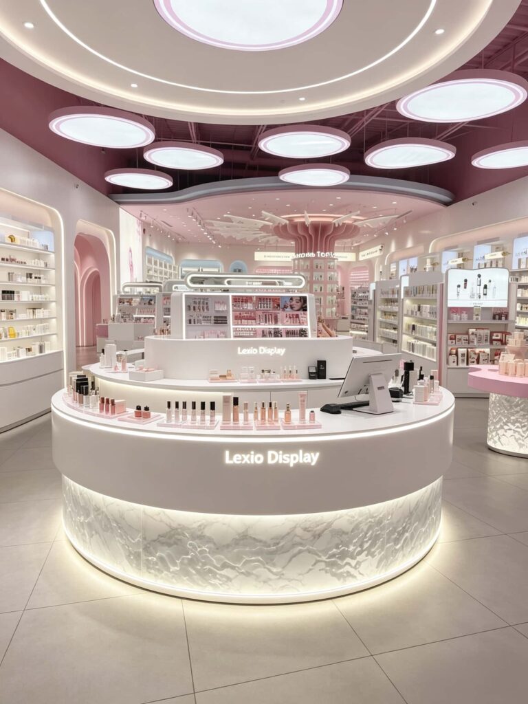
What’s the difference between a regular pink store and a high-end pink beauty store?
Both are cosmetics stores with a pink theme. Some of them make you feel luxurious and of high quality when you enter, while others give off a sense of cheapness. The core difference actually lies in these 4 details.
The logic of color combination is different
In ordinary pink stores, the entire store usually uses a uniform bright pink color, without distinguishing the main and secondary colors. When viewed from a distance, it appears messy and dazzling.
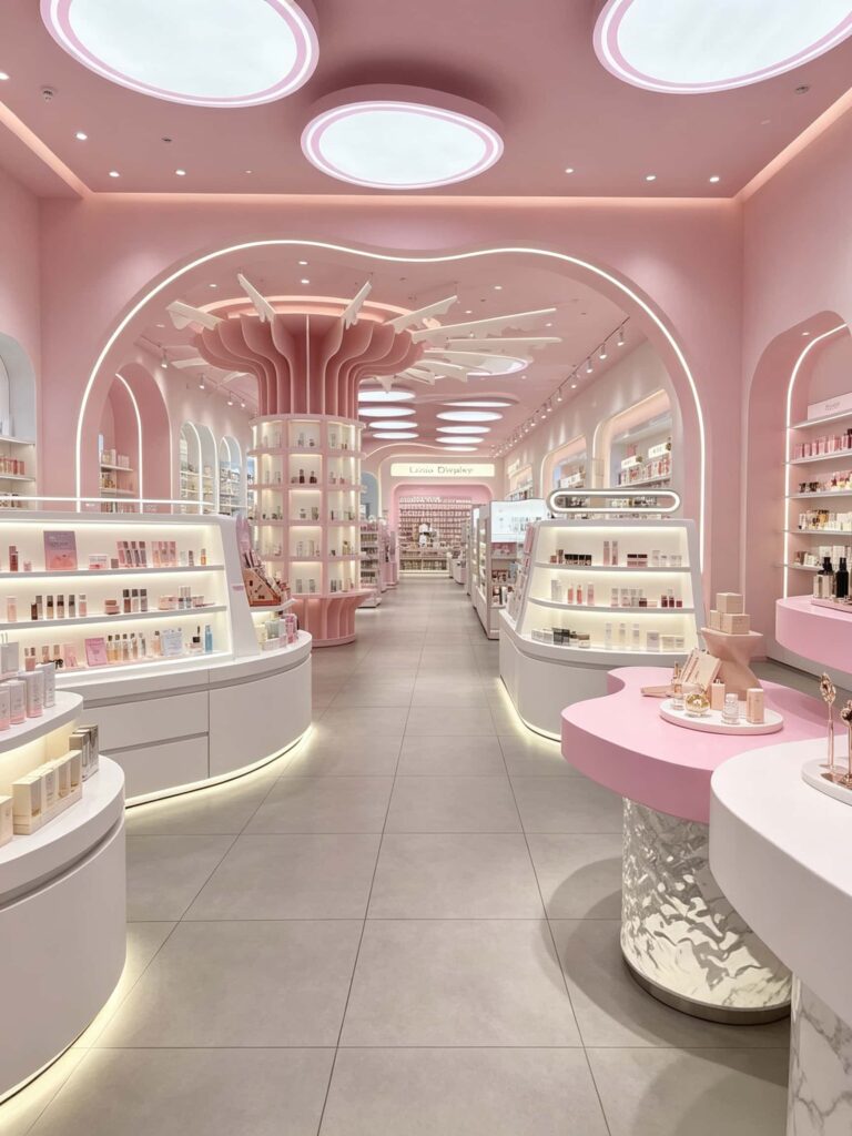
In high-end pink stores, they follow the principle of “70% main color + 25% auxiliary color + 5% accent color”. They use low-saturation nude pink as the main color, combine it with cream white and light gray as the base color, and use deep pink for styling embellishments in some parts. For example, in the case store, the walls use light peach pink, the main body of the display cabinet uses cream white, the countertop and decorations use a shade of deep pink, and are complemented by white marble texture, resulting in a soft and pleasant overall appearance that won’t cause visual fatigue after a long time of browsing.
The choice of materials has different textures
Most ordinary stores mostly use density board spray painting, with a thin texture. After half a year of use, the paint easily peels off and the shape deforms, becoming increasingly old.
In high-end stores, they do material mix-and-match. The main body of the display cabinet uses environmentally friendly baked paint, which is smooth and fine; the base is combined with natural marble patterns and water ripple acrylic, and metal edges are added for local embellishment. For example, in the case of the island counter, the lower part uses water ripple acrylic as the base, with a warm light strip embedded inside, which has more transparency than pure baked paint cabinets, also has a stronger memory point, and has much stronger durability.
The planning of the flow line has different ideas
In ordinary pink stores, the entrance leads directly to a large counter, and the main passage is narrow, making it difficult for customers to turn around. The experience is very poor.
In high-end pink stores, they generally use a circular active flow line. The main passage is left with a width of 1.2-1.5 meters, and the island is placed in a staggered manner. Customers can not only walk through the entire store along the main passage, but also can turn to the side exhibition area at any time, increasing the product reach rate by more than 30%.
The configuration of the lighting system is different
In ordinary stores, only a few flat ceiling lights are installed, with overall brightness but no emphasis. The products on the cabinets have no luster and cannot show their texture.
In high-end stores, they do three-layer lighting configuration: the circular lights on the ceiling serve as the basic lighting to ensure uniform overall light; the light strips embedded in the display cabinets serve as atmosphere enhancement; the shelves are equipped with spotlights to precisely illuminate the products. The light source’s color rendering index Ra ≥ 90, and there is almost no color difference when customers try the colors, resulting in a higher transaction rate.
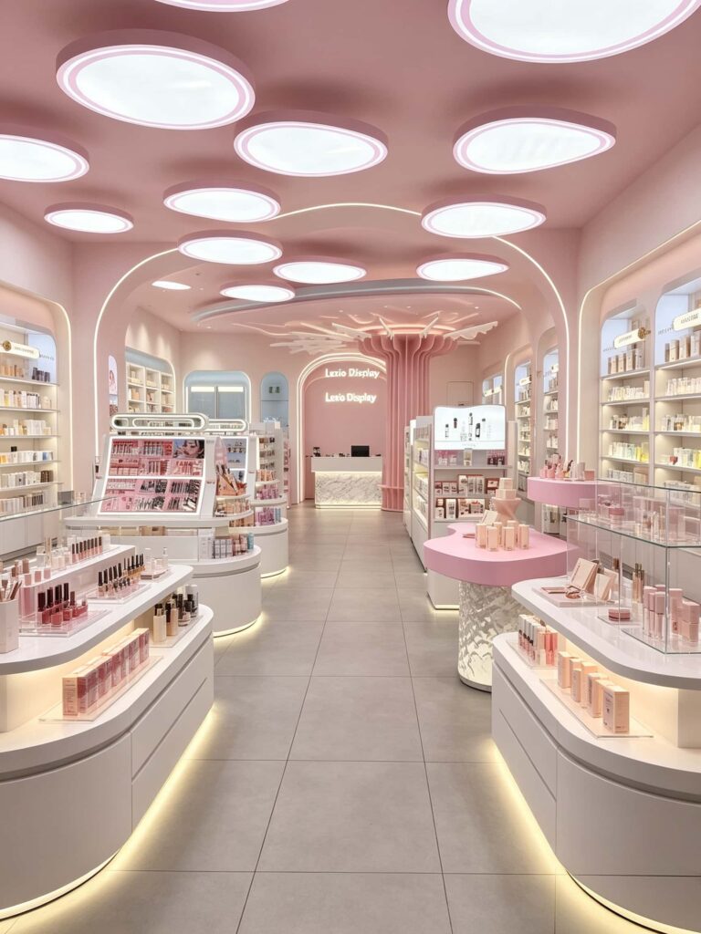
How to plan a high-conversion pink beauty store?
To design a successful pink beauty store, follow these five steps. This will not only yield good results but also ensure good business performance.
Step 1: Establish the Pink Tone – Choosing the Right Shade is Key
Don’t just pick any pink right away. First, determine the color scheme based on your brand positioning and target customer group.
- Affordable/Mass Market Approach: Choose peach pink + pure white. Lively and approachable, suitable for fast-fashion beauty stores in university towns and pedestrian streets.
- Mid-to-High-End Boutique Approach: Choose grayish nude pink + milky white + light marble. Soft and sophisticated, suitable for department store counters and high-end concept stores.
- Instagrammable/Instagrammable Approach: Use deep pink for accent walls, paired with arched doorways, suitable for street-front stores in commercial streets.
- Remember this principle: Pink should not account for more than 50% of the overall store color scheme. Use white, wood tones, and marble tones to neutralize the effect and prevent it from becoming overwhelming.
Step 2: Plan a Circular Flow to Allow Customers to Naturally Browse the Entire Store
The core goal of a beauty store’s flow design is to extend customer dwell time and ensure more products are seen.
- Recommended general circular flow design: Leave ample open space at the entrance and place a flow table to attract passersby into the store.
- The main aisle is 1.2-1.5 meters wide, with tall cabinets against the walls on both sides extending inwards.
- In the center of the store, island counters are arranged in a staggered pattern, showcasing makeup and best-selling products, allowing customers to easily grab and try them on.
- At the far end of the store is the cashier and experience area, allowing customers to browse all product categories while paying.
- The case study store we implemented uses a standard circular layout. The entrance is open and unobstructed, with island counters arranged along the main aisle, ending at the cashier. Customers naturally walk through the entire store after entering, resulting in an average dwell time 30% higher than in typical stores.
Step 3: Zoning by Product Category and Matching Corresponding Display Formats
Different beauty product categories require completely different display methods; not all products can use the same type of cabinet.
- Skincare sets and full-size products: Use tall wall-mounted cabinets, displayed in layers, with shelving and LED strips, creating a neat and upscale look, while also providing storage cabinets at the bottom for restocking.
- Lipsticks, eyeshadows, and other makeup products: Use ergonomically designed island counters with slanted shelves for easy customer access and testing.
- Fragrances and niche items: Use uniquely shaped display counters at varying heights to create a key recommendation area and enhance the perceived value of the products.
- Trial and experience area: Equipped with dedicated trial tables, mirrors with lighting, and charging ports to improve the customer experience and extend their stay.
- Pay attention to the use of prime display areas. The 80-150cm height is where customers’ eyes are most focused; place featured and high-profit items there. Store inventory or decorations on top and use the bottom for storage, maximizing space utilization.
Step 4: Three-tiered lighting design to restore the true texture of the products
The lighting in a beauty store directly affects the customer’s trial and testing experience and their willingness to buy.
- A well-designed three-tiered lighting scheme yields the most significant improvement: Basic lighting: Use round ceiling lights for a no-main-light design, providing soft, even, and non-glaring overall light.
- Accurate Lighting: Each display shelf is equipped with recessed spotlights, precisely targeting the products to highlight the bottle’s texture and packaging details.
- Ambient Lighting: Concealed LED strips are installed at the bottom of the display cases, and linear lights are added to the wall designs to enhance the space’s sophistication.
- Light Source Parameters are Crucial: Warm white light with a color rendering index (CRI) of Ra≥90 and a color temperature of 3500-4000K is closest to natural light, ensuring virtually no color difference when customers try on lipsticks or foundations, significantly reducing after-sales issues.
Step 5: Enhance Brand Memory with Detailed Design
Many stores look good, but few are memorable and shareable. Here are a few low-cost ways to add value:
- Illuminate the logo lettering on the storefront for a prominent and clear look that attracts attention from a distance.
- Set up 1-2 photo spots inside the store, such as an arched doorway or a tree-shaped island design. Customers are encouraged to take photos and share them on social media, generating free traffic.
- Print the brand logo on all display cases to repeatedly reinforce brand image and increase brand recognition. The cashier counter features a custom design, complete with marble finishes and LED strip lighting, conveying the brand’s quality even during checkout.
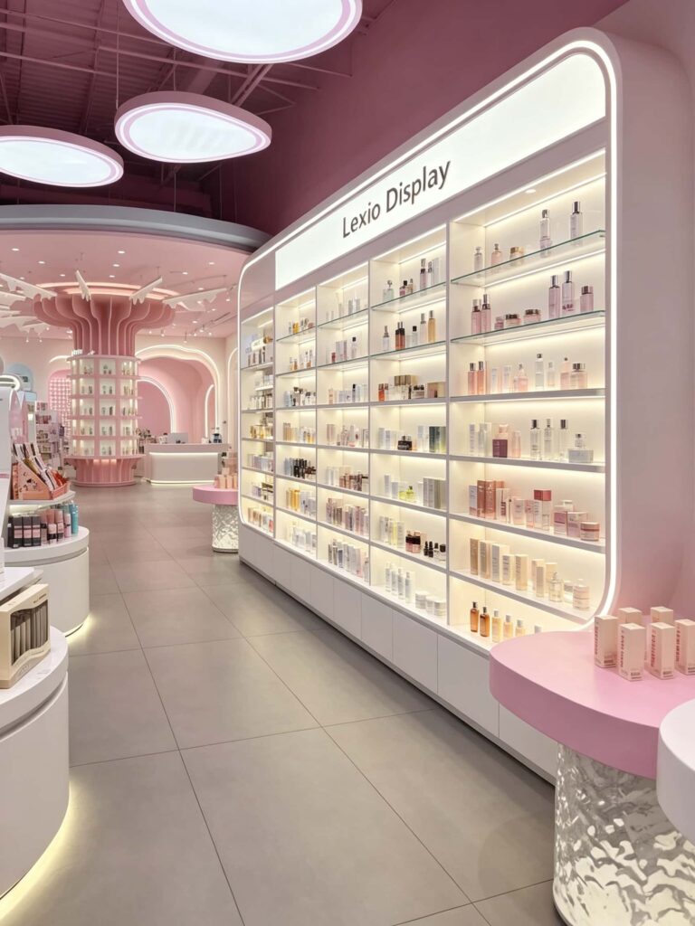
How to design a pink beauty store and keep the budget from going over budget?
Many store owners are worried that creating a high-end pink store will exceed the budget. In fact, with the right approach, the cost can be completely controlled.
- First, prioritize modular display cabinets. Standard-sized display cabinets are about 30% cheaper than fully customized ones and can significantly shorten the production time.
- Second, invest in key areas and streamline secondary areas. The entrance sign, the island area, and the cashier counter are the visual core. Allocate the budget to these three areas; the storage area in the back and the staff area can use ordinary cabinets, and there is no need to pursue the appearance level.
- Third, be flexible in material selection. Don’t be obsessed with natural stone. High-quality painted boards + imitation marble finishes have a visual effect similar to the real thing and can save half the cost.
- Fourth, collaborate with source factories. Skip the decoration company and the middlemen, and have one-stop connection for design, production, and installation. This not only offers a higher cost-effectiveness but also ensures a more controllable implementation effect.
The design of a pink beauty store is never as simple as “painting the walls pink”. From color coordination, flow planning, to customizing display cabinets and adjusting lighting, every detail affects the store’s entry rate and transaction rate in the end.
If you are planning a pink cosmetic retail store and need custom display fixtures or full-store design solutions, welcome to send us your inquiry.
We support MOQ 1, 7-15 working days fast production, and free space layout design based on your store dimensions. Our professional team will get back to you with a detailed solution and quotation within 24 hours.