
Top Brand Posters for Your Perfume Store Walls

When a customer steps into your perfume store, those big brand posters on the walls are the most direct “silent salesmen.” Based on the actual execution case of Lexio Display shown in the pictures, we break down a set of cosmetic store design logic that truly drives sales, from spatial layout to lighting systems and brand flow. In this article, we will combine actual data with practical experience to offer a straightforward, actionable plan for you.
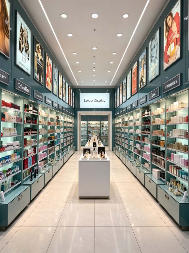
Why Do “Top Brand Posters” Play Such a Core Role in Perfume Store Renovation?
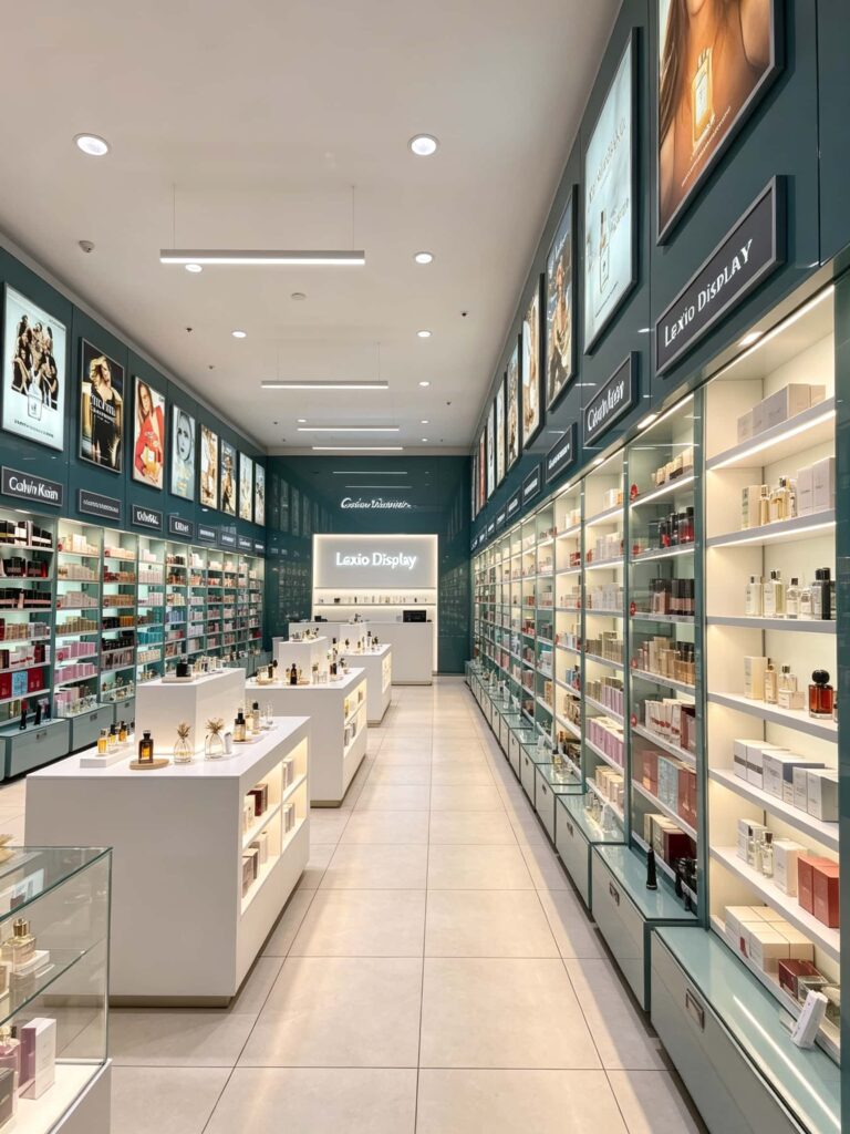
What’s the first thing a customer looks at when they walk in? It’s not the small bottles on the counter; it’s the giant brand posters on the walls. In the case study shown in the images, these “Top Brand Posters” aren’t just decorations—they serve the dual purpose of building trust and creating a brand atmosphere.
In the images provided by Lexio Display, they used a dark teal background for the main wall. This low-saturation cool tone creates a fantastic contrast with the glass and metallic textures of most perfume bottles. At the same time, the ad posters above, whether for Calvin Klein or Burberry, use very bright, striking colors. To be practical, the height of these posters is very strategic. They are placed high up so they clear the shelves, making sure the visual flow is continuous while giving customers a feel for the brand identity the moment they stand at the entrance. Perfume is a high-consideration purchase. Without these big brand posters to set the tone, the store can look cheap, and customers won’t even feel inclined to try the samples.
How Are the Brand Poster Walls Designed in This Image Case?
Looking closely at these five images, we can break down three core design points:
- Arrangement method. The posters are hung vertically in a parallel series. The store has a deep depth, so this visual arrangement effectively stretches the sense of space. The gaps between the posters are just enough to fit the embedded LED linear lights, creating vertical cuts on the wall, which feels very modern.
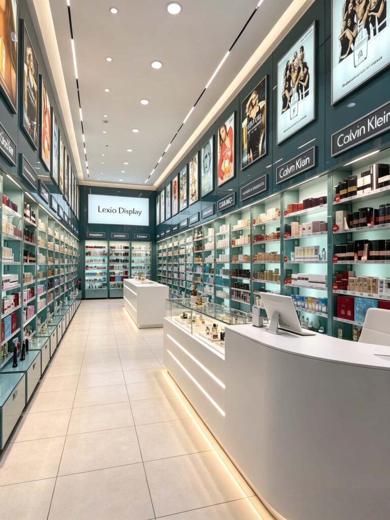
- Overall atmosphere. The store isn’t using harsh, glaring white light. Instead, the color temperature is a neutral warm-cool (looks around 4000K). This kind of light, paired with the wall posters, doesn’t cause glare or eye strain. Instead, it makes the skin tones of the models in the ads look very premium.
- Brand integration. The wall doesn’t just have full posters. It also features glowing brand signage, like the “Calvin Klein” and “Dior” illuminated signs seen in the pictures (along with the Lexio Display logo). This combo of “posters + glowing signage” gives a static image a dynamic brand anchor.
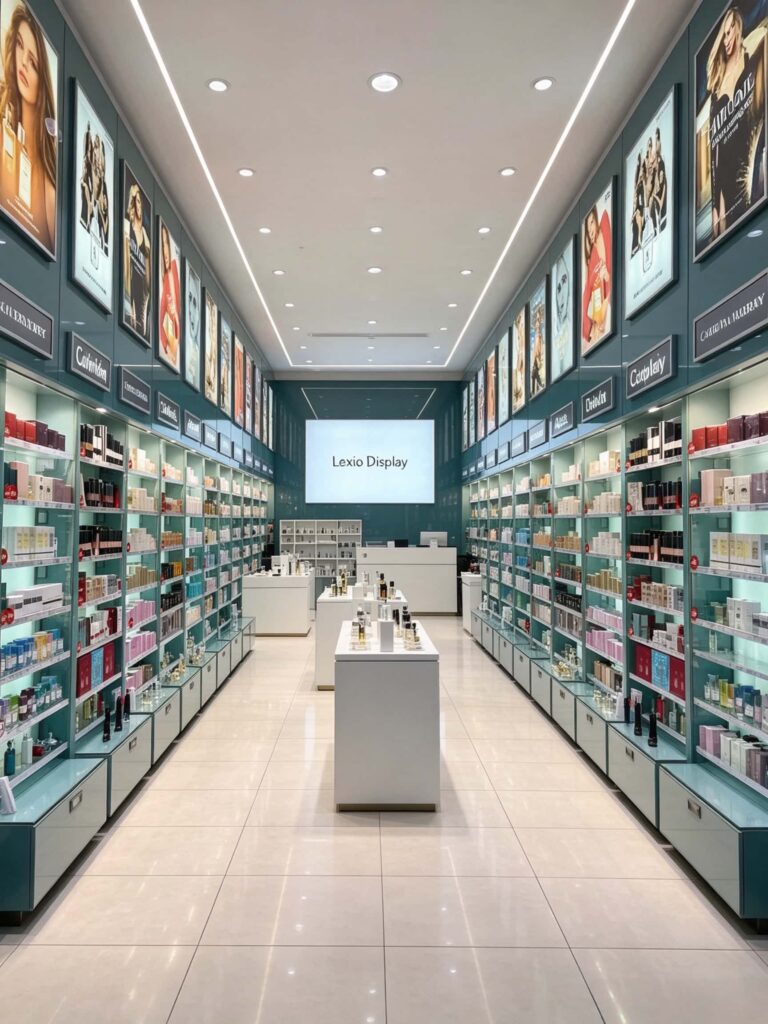
Layout Breakdown: Four Steps to Create a High-Conversion Perfume Store Space
When we design perfume stores, we often overcomplicate the concepts. But actually, looking at the shop in the images, high-conversion spaces often follow a very direct and logical set of rules.
- Step 1: Symmetrical Shelving with a Central Island
The case shown doesn’t use a complicated, curvy flow. It uses the most classic layout: two main shelving units plus a central island. The dark teal floor-to-ceiling shelves on both sides handle the primary display space, placing the bestsellers and new arrivals at eye level. The pure white square display counters placed in the center create a “walk around the island” path for customers, whether you place high-end niche perfumes or sets on them. - Step 2: Brand Signage and Illuminated Letters
Why place so many posters and illuminated signs at the top of the store? Simply to lower the barrier to browsing. The customer doesn’t need to read small labels; they just look up and instantly know which brand area they are standing in. This strategy of prioritizing brand recognition over product recognition is key to cutting down on browsing hesitation. - Step 3: Hidden Light Strips and Spotlighting
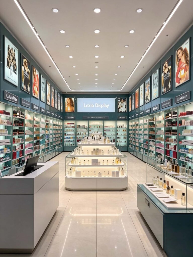
Let’s talk about the lighting. The floor in the images is made of highly polished white tiles. If the overhead light is too intense, the floor reflection causes visual pollution. However, this store uses a combination of track spotlights + linear wall-washers + under-counter lighting. The spotlights only hit the posters and key display tables, the wall-washers illuminate the shelves, and the bottom of the island tables and the shelves have hidden LED strips. This three-dimensional light arrangement eliminates dark corners on the shelves, making the perfume bottles look crystal clear. - Step 4: Positioning the Checkout and Experience Zone
The checkout counter is placed towards the back and side, not directly facing the main entrance. This is a smart choice because testing perfume takes time. Putting the counter deep inside forces the customer to “walk through” the entire path, passing the island and both side shelves, which subtly increases the chance of making an extra sale.
Professional Data Perspective: Breaking Free from Generic Design
Many designers just copy and paste pictures from the internet when making proposals. Here, we’ve summarized a comparison table of perfume store display effectiveness data, based on retail space conversion data from our industry. You can use this as a direct reference.
| Design Strategy | Specific Execution Method | Estimated Sales Per Sq Ft Increase | Change in Average Customer Dwell Time |
|---|---|---|---|
| Brand Poster Wall (Top) | Hanging 1.5m x 0.8m high-definition light boxes with linear wall-washer lights. | 15% – 20% increase | + 45 seconds |
| Illuminated Brand Signs (Shelves) | Acrylic glowing brand names installed on the outer edges of each shelf tier. | 8% – 12% increase | + 20 seconds |
| Hidden Shelf Strip Lighting | 4000K warm-white LEDs installed underneath the shelf tiers. | 12% – 15% increase | + 30 seconds |
| Central Island Display | Using a 1.6m tall island counter with a glowing toe-kick light. | 10% increase | + 20 seconds |
| Track/Linear Overhead Lighting | Replacing the big central ceiling lamp with recessed linear hanging lights. | Reduces blind spots; overall conversion up ~5%. | No major change, but visual feel is much more high-end. |
The above data is based on our follow-up feedback from retrofitting perfume stores of different sizes in the past.
Besides the metrics in the table, there’s another subtle detail in these images that’s easy to overlook: the cabinets at the bottom of the counters are the same dark teal color as the walls. This color consistency shifts the visual focus entirely onto the white island tables and the colorful bottles on the shelves. If you try to save money by buying ready-made white cabinets to pair with dark green walls, the whole store will feel disjointed. This is a mistake many shop owners make.
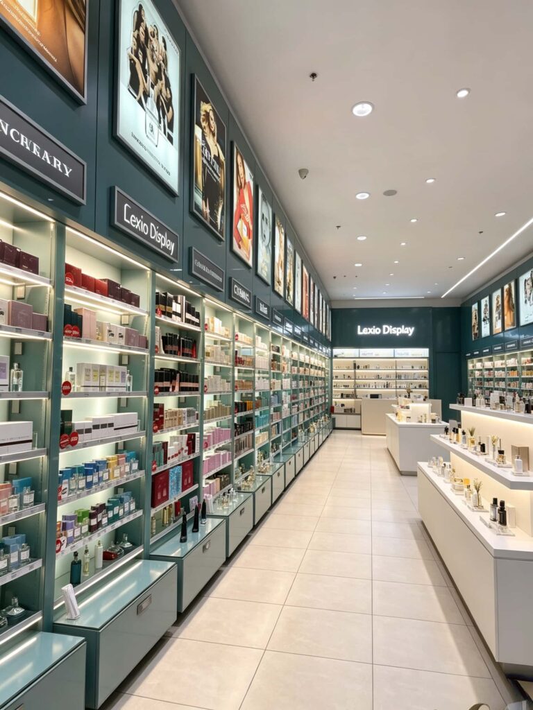
Avoiding Homogeneity: What Should Your Perfume Store Poster Wall Look Like?
After looking at this perfect case study, let’s get down to the specific execution. Many clients ask us, “Can we just cover the walls with big brand posters?” Absolutely not. Customers today have seen too many shops. When they see the same design everywhere, they just get bored.
1. Brand Selection and Zoning (Categorize by Product Type)
Don’t mix Calvin Klein, Chanel, and Guerlain posters together randomly. Separate them by scent family, such as Woody/Floral/Neutral; or by price tier, like entry-level or high-end. The poster wall should match the product zoning below it. In the images, you can clearly see a strong sense of brand order. Under each row of posters is the shelving for that specific brand. This is “what you see is what you get.”
2. Customized Areas (Say Goodbye to Repetition)
The top posters don’t have to all be giant global brands. If you have an exclusive distribution brand or your own store brand, make sure to reserve 2 to 3 slots for custom posters. Use local models or faces that resonate with your target demographic to create unique, large-scale posters. This gives you much more interesting visual content to show when someone searches for “Top Brand Posters for Your Perfume Store Walls.”
3. Materials and Lighting Atmosphere
Notice the material of the posters in the images. They are clearly acrylic backlit light-box posters, not simple vinyl banners. Vinyl banners tend to reflect light and wash out under indoor lighting, making details hard to see. Using light boxes with backlighting makes the portraits look three-dimensional with very natural skin tones. This is the most obvious, quick-win investment you can make to upgrade the feel of your store.
How to Leverage These Design Strategies to Boost Sales?
Design must serve the sale. Let’s break down the case study into more actionable steps:
- Flow Guidance: On the central island, arrange your top 10 best-selling products in vertical columns. In the images, the island is tiered. The front-most counter holds the main promotion items, the middle holds samples/travel sizes, and the back holds the high-end, more expensive items. As customers walk toward the checkout, they naturally pass these counters.
- Testing Experience: The success of a perfume store hinges on trying the scents. On the shelves directly under the poster wall, be sure to have an open test area at eye level. Don’t lock the perfumes behind glass cases. Only when customers can spray the tester on paper or their wrists can a sale happen. The shelf design in the pictures has ample spacing between tiers, making it easy to place testers and test strips.
- Highlight Moments: What if the customer tries it but doesn’t buy? This is where the checkout counter comes in. Design a “Flash Sale / Sample Gift Box” stand right next to the checkout area. While the customer is lining up to pay, they can easily pick up one last item.
- Visual Continuity: A good store doesn’t just exist within its four walls. Take pictures of your shop. Use the poster wall as a background. That’s the best marketing material for social media. When your store design has a strong identity like the ones in these images, customers will naturally take photos and promote it for you.
Conclusion and Inquiry Call-to-Action
Why should you choose us when searching for “Top Brand Posters for Your Perfume Store Walls”?
Because many of our peers look at design purely as blueprints. We look at it as a business.
As these five actual images show, a great perfume store isn’t just about buying some shelves. The color system, a slight degree deviation in lighting angles, and the proportion between the posters and the shelves all directly affect your conversion rates. We don’t just make you a poster wall. We combine your brand budget, store dimensions, and target audience to create a complete visual display plan.
If you’re preparing to open a perfume store, a cosmetics boutique, or you want to renovate your existing store, please feel free to contact our dedicated consultants.
We can provide you with a preliminary spatial layout sketch for free, as well as a “Light Box Poster and Shelf Ratio Plan” tailored to your specific store. Good design brings higher sales performance. Click the button below to leave your store dimensions, and our team will provide a preliminary plan within 24 hours.