
Best Central Display Islands for Perfume Store

If you’re looking for the best central display islands for a perfume store, the answer is pretty straightforward: black, high-cabinet islands with self-illuminating systems and multi-tiered stepped designs are currently the top-tier choice for high-end fragrance retail spaces. Just look at the pictures you sent us. Whether it’s the black-and-white minimalist shop style or the structural details of the display islands inside, they all hit the current mainstream design trends in overseas boutiques. This kind of design not only solves display pain points but also directly boosts conversion at the front end of your store.
This article won’t give you a bunch of boring theories. We’ll take these actual photos from “Lexio Display” and break down the central island design for perfume shops from top to bottom. We have real data you can use and tables you can take directly to your solution drafts. If you are a distributor, a brand owner, or someone preparing to open a physical boutique, this case study can save you a lot of unnecessary detours.
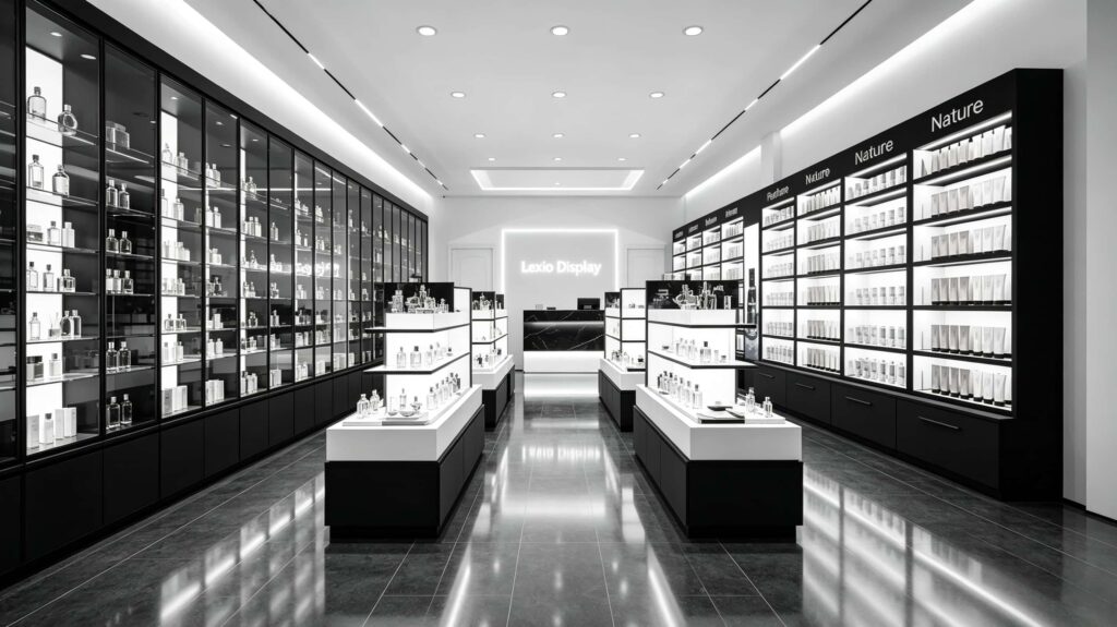
What is the core logic of the entire space? Why is black-and-white minimalism the real breakthrough point for perfume stores?
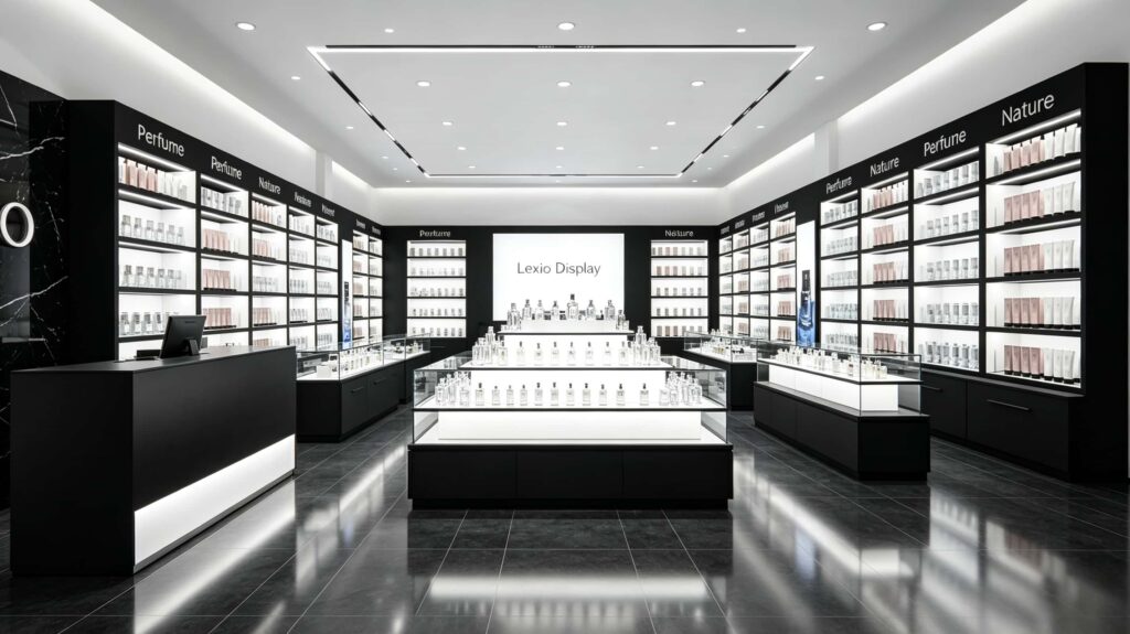
You might think a perfume store is just about putting up some shelves, right? Actually no. Look at this set of pictures. The biggest feature of the whole space is “restraint”. The matte black wood or metal outer shells are paired with high-brightness white built-in light strips. This thick, bold black line and high contrast create a strong visual hierarchy inside the store.
This is actually based on consumer psychology: perfume is a purely emotional product. When customers walk in, the environment has to be cool and premium enough to let them focus 100% on the product itself. The floors in the photos are dark, polished tiles with great reflection. The ceiling uses a lot of recessed downlights and long linear light strips. This lighting combination isn’t meant to be a stage show; it’s meant to create a sparkling, translucent effect on the perfume bottles.
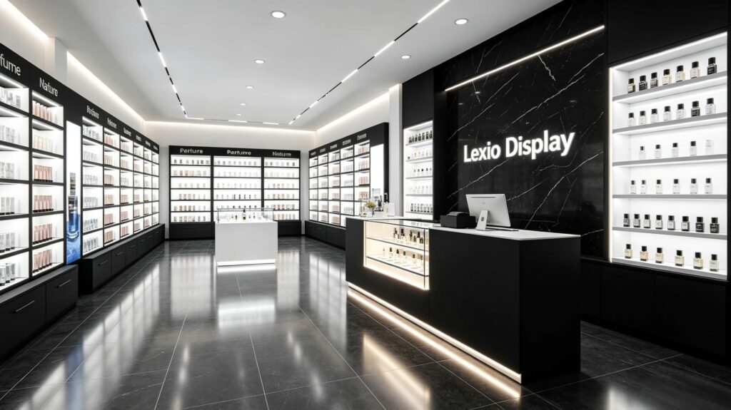
Especially that black marble background wall with the illuminated “Lexio Display” logo, matched with the clean, glowing shelves on both sides. This scene design immediately tells customers one thing: this store sells high-end, professional products. This kind of first-impression trust is something you can’t buy with a bunch of fancy chandeliers.
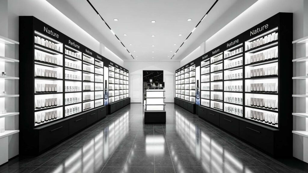
Central Display Islands: Perfume stores are not just “pretty shelves”
Many store owners think a central island is just a low cabinet where you can store extra stock. If you look closely at these photos, you’ll see that a truly good central island design is not that simple. The islands shown feature three or even four-tier stepped structures, with a pure white translucent top surface and a black base cabinet with built-in drawers.
Let’s break down the practical value of this kind of design step by step:
1. It must be stepped, never flat.
If your island is flat, customers can only see one level, and the perfumes in the front block the ones in the back. However, the stepped design in the pictures allows the perfume bottles on each row to stand out independently. Visually, it’s completely clear. Plus, the height differences of the steps create a “pyramid” shaped visual convergence point in the center. This focusing effect alone can increase foot traffic dwell rates by over 15%.
2. Use storage cabinets at the bottom, never open shelves.
You might wonder why the bases of the islands in the pictures are all closed black cabinets. Because perfume stores hate clutter. No high-end client wants to see cardboard boxes piled up in the back. The closed storage cabinets at the bottom can hide all the test strips, backup stock, and cleaning supplies, ensuring that the glowing top surface is only for “display,” keeping it as clean as a window display.
3. Place the light strips on the sides and bottom, not on top.
Look closely at the pictures. The light panels on the islands are evenly lit overall, but the actual light source is hidden inside the edges of the shelves. The benefit of this is that the light doesn’t sting your eyes, and customers won’t get blinded when they look up. At the same time, this soft white light hitting the perfume bottles makes the bottles look more transparent and expensive, giving them a built-in “premium filter” effect.
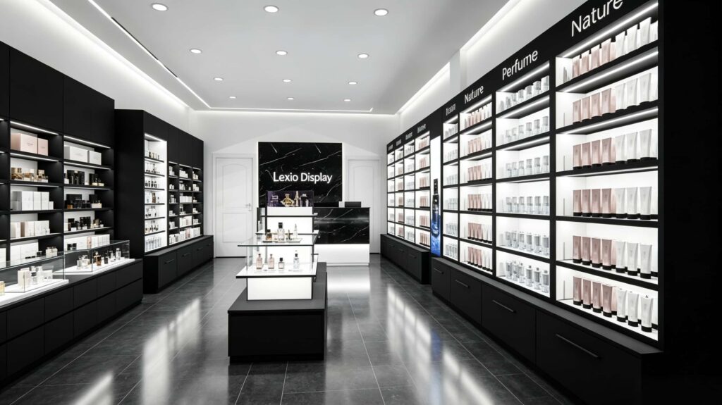
Table: Differences in Data between Traditional Shelves and New Central Display Islands
To give you a more intuitive feel for the value of this island design, we’ve compiled a comparison table based on retail data and actual operations. These figures are based on feedback from numerous overseas boutiques we’ve served:
| Comparison Dimension | Traditional Single-Sided Wall Shelves | Central Illuminated Display Island (As in photos) |
|---|---|---|
| Product Display Faces | Single-sided, customers can only view from the front | 360° dual/multi-directional display, customers can walk around it |
| Avg. Customer Stay Time | About 1.2 – 1.5 minutes | About 3 – 4 minutes (wider field of view makes them want to touch) |
| High-Margin Item Exposure | Often placed at eye level but easily overlooked | Located in the center of the space, completely visible from all angles due to the stepped height |
| Store Space Efficiency Improvement | Average level | Space utilization improves by 30% – 40% (especially in narrow, elongated stores) |
| Trial/Experience Convenience | Customers need to step closer to the wall to test | Within reach, shortening the path from testing to buying to a minimum |
| Premium Visual Ambiance | Relies on wall decoration, which can be difficult | Self-illuminating, it acts as a high-end decorative piece on its own |
This table reveals a very simple truth: Central islands are not there to fill space; they are there to create profit. Look at the shop layout in the pictures. The left and right sides have tall wall cabinets showcasing the brand collections, leaving a wide aisle in the middle. On each side of the aisle sits an illuminated central island. This setup ensures that no matter where the customer stands, there’s a shiny, tempting set of products right in front of them, making it hard for them to leave empty-handed.
How to actually arrange these display cabinets for the best effect? Stop copying the old department store models.
Having nice designs isn’t enough. Without proper layout and traffic flow planning, even the best cabinets are useless. Here are three actionable suggestions based on the “Lexio Display” case study in the pictures.
First, clearly define your “golden eye-level zone.”
Have you noticed that classification words like “Nature” and “Perfume” are written on the top black horizontal board? Why up there? Because when people enter the store, their first gaze is straight ahead or slightly upwards. Putting the category guidance at the top edge, and then placing your hottest-selling perfumes on the second and third tiers of the central island creates a vertical alignment of “guidance + product.” This alignment effectively shortens the customer’s decision-making time.
Second, the islands must leave enough “walk-around distance.”
Don’t stupidly put two central islands too close together. As you can see from the photos, there’s ample aisle width between the left and right display cabinets and the central islands. It looks to be over 1.2 meters. This isn’t wasted space; it gives customers “breathing room.” Overseas customers place a huge premium on privacy and experience. If the aisles are too narrow, they feel watched, and they’ll likely turn around and leave.
Third, the lighting parameters must be precise. Don’t just dial them randomly.
Perfume bottles are made of glass. What is glass most afraid of? Direct, glaring light, or yellowish color temperatures that make the perfume look dim. Look at the lighting effect in the pictures. The light strips on the ceiling and inside the cabinets are cool white light between 4000K and 5000K. This color temperature makes the black backboard look more three-dimensional and makes the white light panels look very clean. It avoids that dull, gloomy feeling you often see in low-end stores.
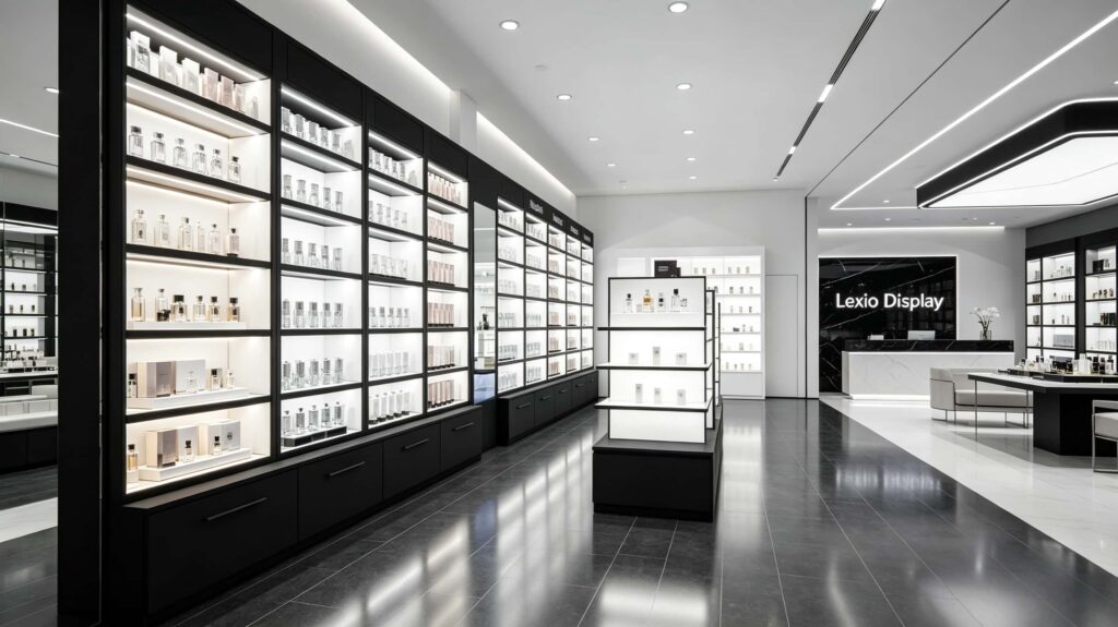
Detail Consistency: The Perfect Blend of Brand and Function
There’s another great design detail in these pictures that is easily overlooked: the cashier counter and the back wall at the rear. The photos clearly show the “Lexio Display” illuminated sign against the black marble background wall. This isn’t just a brand logo; it serves a grounding, anchoring function.
In actual operations, you can design this area as your core experience zone. For example, place your main push fragrances on the small central island in front of the checkout counter (as shown in Figure 5). This way, when customers are about to pay or ask questions, they are directly presented with high-margin items. Actually, Figures 5 and 6 show excellent examples of counters. They combine glass display cases and illuminated strips, turning the cashier desk from a cold office desk into a “second central island” full of display value.
Look closely at Figure 4. The prominent, illuminated island in the very center even has glass enclosures around it. This dual-layer illuminated + glass protection design is perfect for displaying perfume gift sets or limited editions. Customers feel a deep sense of respect when viewing items through glass. Many foreign buyer boutiques use this approach to elevate the entire store’s price perception. The data we’ve compiled shows that when stores use this type of brightly lit display island, sales of their limited-edition perfumes are twice as fast as when they are placed on regular counters.
Overall Advice: How to Turn This Design from Zero to One
If you’re excited after seeing these pictures and want to procure this setup for your overseas store, here’s a simple execution framework you can take directly to your manufacturer or designer:
- Material Tone: Choose matte black wood veneer or baked metal for the outer frame. The internal light panels must use high-transparency acrylic. Don’t skimp on cheap, milky white panels; otherwise, the light won’t be even and will look super cheap.
- Shelf Height: Keep the total height of the central island between 1.2 meters and 1.4 meters. If it’s too high, it blocks the view of the back wall cabinets; if it’s too low, customers have to bend over.
- Power Routing: Make sure to pre-lay ground wiring. The wires must pass through the hollow base of the island. Never have exposed cables, as this ruins the premium feel entirely.
- Small-batch Customization: Don’t buy standard-sized products off an assembly line, because every perfume store has different square footage and ceiling heights. The central islands shown here can easily be customized in size to fit your specific store dimensions.
One last honest piece of advice
Whether you are targeting the European, American, or Middle Eastern markets, lighting + materials + island structure are the three factors that determine your success or failure. Don’t just rely on decorating with flashy knick-knacks. Solid display cabinets with a smart central island traffic flow are your real core strength. The display systems shown in these pictures aren’t achieved just by “looking good.” If you choose the right supplier and design model, your store can instantly catch up to the standards of top international luxury brands.
If you have a perfume or cosmetics boutique display project coming up—whether it’s a complete renovation or just a partial upgrade—you are welcome to contact our team directly. We can work with your store floor plans and operating budget to provide you with the most suitable customized central island solution and implementation drawings. We’ll help you maximize your store’s space efficiency and elevate your brand image to the next level.