How to Make Your Ice cream Shop Look Elegant

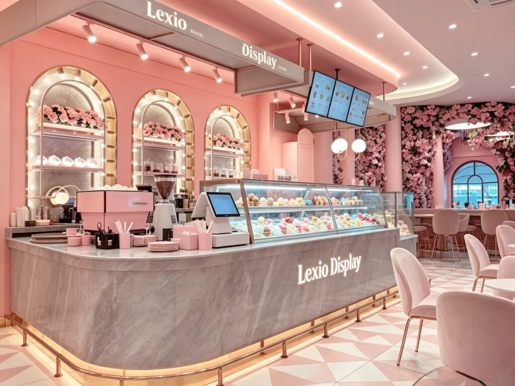
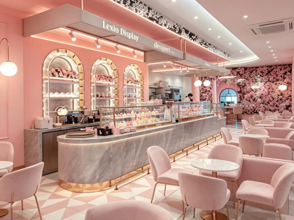
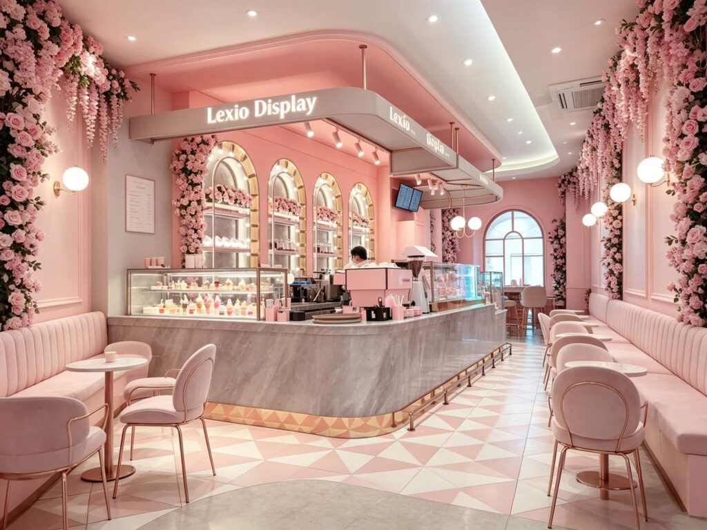
How to make an ice cream shop look elegant? To be honest, just covering the walls with a layer of powder paint won’t do. Take a look at this real photo case of Lexio Display. The source of the sense of sophistication is not the “pink” itself, but the use of marble bar counter, geometric tiles, rose gold edging, and arches. This store has incorporated all the materials that make you feel “expensive” into the daily operation of an ice cream shop. Today, let’s deeply analyze and break down what design tricks are hidden behind this. What are the things that can be copied from this?
The Business Logic First: How Does Elegant Design Make You Money?
Many shop owners think spending big on decor is just buying a nice space. Honestly, that’s only the first layer. If done right, good design directly translates into real revenue.
Look closely at the details in these pictures:
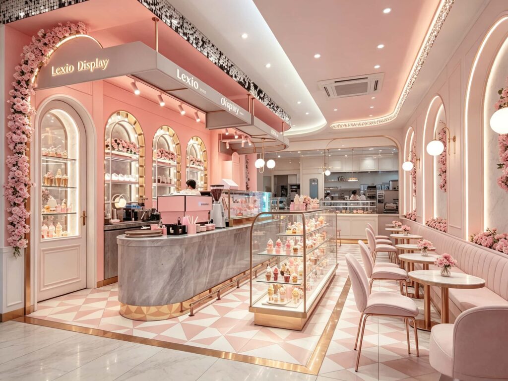
- Foot Traffic: The huge arched entry and the clear glass display fridge mean people passing by can instantly see what’s inside. This works better than any street sign to draw them in.
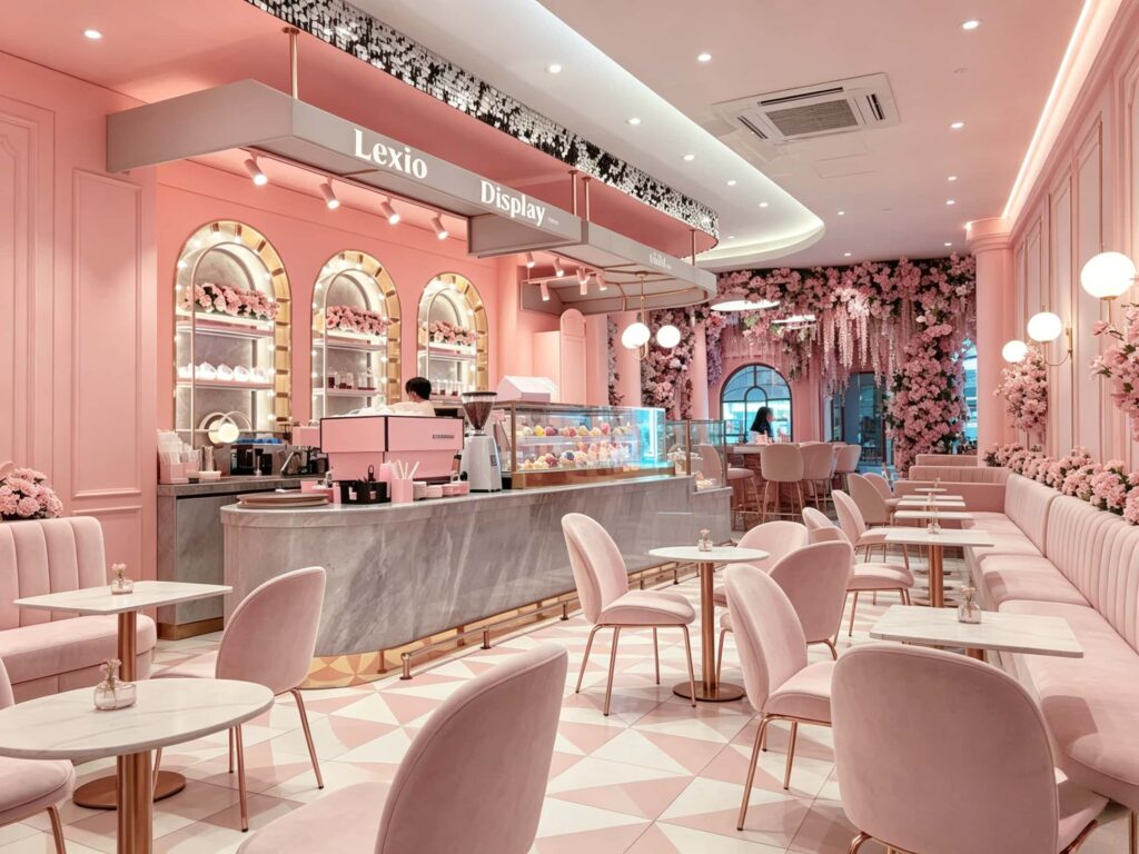
- Dwell Time: Those pink velvet banquettes are super comfortable. That cozy environment makes customers want to sit down and stay. And as long as they are sitting, the odds of them ordering a second drink or an extra dessert go way up.
- Social Sharing: These days, people are buying for the experience and the pictures. Every part of this shop—the lighting, the floral arrangements, the geometric floor—is naturally “Instagrammable”. When customers post their photos on IG or TikTok, they’re giving you free marketing.
I’ve organized the core design modules and their commercial benefits into the table below. Take a look.
Table 1: Elegant Design Elements and Their Commercial Conversion Value
| Core Design Module | Specific Materials / Techniques Used | Real Business Benefit (Commercial Value) |
|---|---|---|
| Service Counter | White marble top + pink base with rose-gold metal trim | Immediately boosts “premium perception”. Marble is sleek and high-end; paired with rose-gold and pink, it just looks expensive. This counter makes customers feel the products are worth the price. |
| Product Display Area | Built-in arched shelving + LED strip lights + glass doors | Sells products with visuals. Lighting hitting the desserts makes them look irresistible. Seeing the ice cream and cakes in lit display cases doubles impulse purchase desire. |
| Flooring | Pink and white geometric triangle tiles with rose-gold trim | Enhances brand recall. This custom floor pattern is an eye-catcher. Not only is it slip-resistant and durable, but it becomes a unique visual symbol for the brand whenever customers take photos. |
| Seating Area | Built-in pink velvet banquettes + round-back single chairs | Increases ticket value and turnover. Banquettes save space; single chairs are flexible. The soft materials make guests comfortable enough to linger—and if they chat for an extra half hour, you get an extra coffee sale. |
| Ceiling & Lighting | Floating gray ceiling canopy, track spotlights, glowing logo, globe wall sconces | Multi-layered ambient light. The 2700K-3000K color temperature on the pink and white surfaces creates a built-in “soft filter”. Customers don’t need to edit their photos, boosting social media reach. |
Breaking Down 3 Core Design Features: Beautiful & Practical Details
Design needs to be practical. Let’s drill down from the theory above into the actual space modifications.
1. The Counter Design: Don’t Turn It Into a Storage Closet
Many shops make the mistake of just sticking the cash register somewhere, facing the wall, with a messy storage area underneath.
But look at these photos—the big highlight is that they created a U-shaped or L-shaped semi-enclosed service station.
- The counter uses a single solid slab of marble with a white base and grey veins. It’s durable, easy to clean, and looks extremely clean and transparent visually.
- Notice the connection between the bottom of the counter and the floor. They added a rose-gold metal baseboard. This detail is crucial! If it’s just a tiled joint, dirt will creep in, and mop water might seep into the cracks. The metal baseboard makes it look premium and is a breeze to clean.
- The glowing “Lexio Display” logo on the front is a nice touch. It doubles as secondary brand exposure—when customers sit and take photos, that Logo is right there in the frame. Pretty clever branding.
2. The Wall Display Shelves: The “Wow Factor” Without Breaking the Bank
That row of arched glass display cabinets built into the wall is the soul of this visual aesthetic.
- These shelves aren’t freestanding; they are built into the wall, with hidden warm LED strips lighting them from the back. That’s the “see the light, not the bulb” trick. The light makes the cups and desserts on the glass shelves look exquisite.
- Frame Material: They deliberately chose rose-gold borders to match the counter baseboard. The combination of rose-gold and warm light naturally triggers a sense of “luxury and sophistication.”
- Floral Arrangements: The pink flowers on top aren’t just standard bouquets; they are designed in a cascading waterfall style. This breaks the rigid horizontal/vertical lines of the walls, adds softness, and prevents the whole pink theme from looking stiff and boring.
3. Flooring and Lighting: Setting the Ultimate Elegant Tone
Even the prettiest design falls apart without the right floor and lighting.
- Flooring is huge: They chose pink and white geometric tile patterns. This grid-style tile is very classy and incredibly stain-resistant. The white base with pink triangular accents matches the store’s main color palette perfectly. Also, this pattern makes the room feel larger, so the space doesn’t feel cramped.
- Lighting is layered into three parts: First, the recessed linear LED strips in the ceiling provide the base light; second, the down-facing track spotlights attached to the floating ceiling precisely illuminate the signage and service area; and third, the globe wall sconces provide a soft ambient glow for the booth seating. It’s this three-layer lighting that finally achieved that “premium yet cozy” effect you see in the photos.
Practical Tips for International Clients: How to Save Money and Headaches?
If we were to open a place like this in North America, Europe, or Australia, copying the photo 100% might hit some bumps, or blow your budget. Here are a few very practical suggestions based on real-world experience.
1. Maintenance Nightmares with Velvet Chairs
A lot of overseas clients worry: “What if a sticky, creamy finger touches this pink velvet chair? Won’t it be ruined?”
- Solution: When sourcing upholstery fabrics, ask suppliers directly for stain-resistant and water-repellent coated velvet, or use tech-fabric (leathaire). These are water-repellent and can be wiped clean with a damp cloth. Do NOT choose those really long-fleece velvets that easily pill.
2. The Pitfall of Using Genuine Marble Countertops
Real stone is incredibly expensive overseas, with shipping costs adding up fast.
- Money-Saving Tip: Don’t buy a huge slab of natural marble. Use artificial stone (quartz or sintered stone) for the countertops. You get the exact same visual effect at nearly half the price. And honestly, artificial stone is much more durable, doesn’t stain, and is way better for a dessert shop than natural marble.
3. Getting the Lighting Color Right
If you get the light color wrong, that pink wall can turn into a ghastly “hospital pink” or a gaudy “salon pink.”
- Must-Buy Spec: No matter where you buy your fixtures, demand the color temperature be set strictly between 2700K and 3000K. This “warm yellow” range hits the pink walls and white marble to create that “creamy, high-end” look you see in the photos.
**4. Linear Lights and Track Systems
The floating ceiling canopy in the photo looks complex, but it’s actually all modular.
- Build Advice: Tell your electrician to pre-install the track channels for the linear lights into the ceiling frame during the framing stage. The light strips can then just slide right in. If you forget to do this until after the ceiling is finished, you’ll have to cut channels and run ugly surface wiring.
Want to Keep Your Budget from Exploding? Watch These Costs.
Many clients ask, “So, how much does a shop like this actually cost?” The money generally goes to three big buckets: Display fridges, Carpentry/Specialty walls, and Furniture.
Table 2: Core Budget Control and Value Trade-offs
| Budget Item | Estimated % of Total Renovation | Advice on Where to Spend |
|---|---|---|
| Professional Glass Display Cases | Approx. 30% – 35% | Do NOT skimp here. This protects your ice cream’s shelf life and appearance. Buy standard-size cabinets and let your carpenter trim the edges. This saves a fortune on custom milling costs. |
| Curved Ceilings & Carpentry | Approx. 20% – 25% | Labor costs are high. Curves need skilled carpenters. If local labor is pricey, consider simplifying the ceiling arch and just keep the arch doorways on the walls. The visual impact will still be quite strong. |
| Furniture, Lighting, Florals | Approx. 15% – 20% | Source this from China. Those pink glass globe lights and chairs have many direct factories in China. While international shipping adds up, the unit price is 40-50% cheaper than buying big-name global brands in the US or Europe. |
| Floor Tiles, Paint, Hardware | Approx. 10% – 15% | Buy locally. These are bulky items. It’s always cheaper to buy them from your local home improvement store. No international shipping delays, and reordering is easy. |
Good Design Brings Good Business
Let’s be real. Ice cream shops and dessert places are everywhere these days. The final battle comes down to “who can make customers stop for an extra second, and make them want to sit down and stay.”
The Lexio Display shop in these photos does something really well. They didn’t just use “elegance” as a cheap slogan; they threw it into every single detail. From the triangular floor tiles, to the rose-gold baseboard on the counter, to the glowing overhead sign and the floral lamps. It lets customers buy an ice cream, but at the same time, they are buying a “premium, respected” atmosphere.
If you have an existing ice cream or bakery shop that’s ready for an upgrade, or if you’re planning a brand-new store concept.
Don’t struggle with it alone. Our team specializes in end-to-end design and construction for overseas F&B and bakery spaces. We understand local fire codes, electrical standards, and we help many clients in the US and Europe source custom furniture directly from China and ship it over.
Feel free to leave a message or send us an email with your shop’s size and a rough budget. We’ll send you a free preliminary floor plan and space vibe concept within 24 hours. Leave the headache of design and sourcing to us. You just focus on making your ice cream taste amazing.