Do You Know How to Make Your Ice Cream Shop Unique?

Do you know how to make your ice cream shop unique? Honestly, it’s not just about the ice cream taste. It’s about whether the shop can make people pull out their phones and take pictures within 3 seconds. Based on the B2B store design cases we serve for overseas clients, today I’m going to break down how this set of macaron-toned ice cream shop interior design actually helps bring in more foot traffic and increase average order value.
How does design make an ice cream shop stand out in 3 seconds?
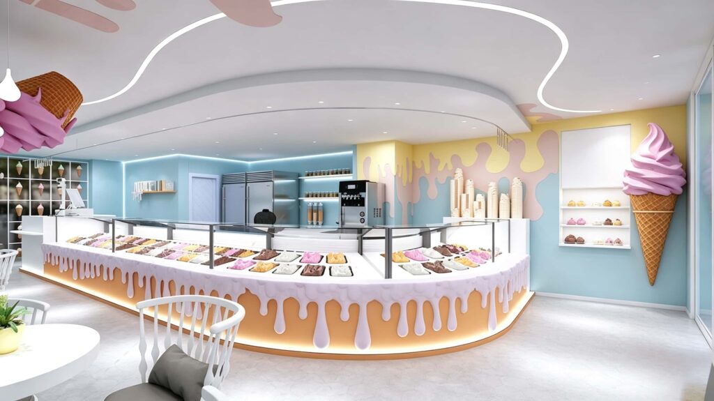
What’s the first thing you notice when looking at this shop? It’s definitely that giant, upside-down pink ice cream cone hanging from the ceiling. In a shopping mall, customers typically only have a few minutes to pass by. You need to plant the thought of “walk in and check it out” into their heads during that short window.
This design uses the smartest trick: Turning product features into spatial symbols. The ceiling has 3D shapes, and the hanging lamps are also designed to look like ice cream. Even if customers don’t buy anything, just seeing these visual elements subconsciously stimulates their desire for sweets. Meanwhile, the large-scale glass partitions paired with warm yellow built-in LED lights make the shop look like a glowing dessert box in the mall. Its recognition is incredibly high. In an era where “appearance is justice,” a good-looking design is basically free social media advertising.
Deep Dive: Unpacking the Design Codes of This Store
If I were to evaluate the spatial logic of this set of pictures, I would look at it from three dimensions: the curved counter, the lighting system, and the color psychology.
The Curved Counter and the “Melting” Design: Even the counter sells
The most eye-catching element in the pictures is the curved display cabinet. Visually, curved lines are softer than right angles. They guide customers to naturally walk along the flow without blind spots.
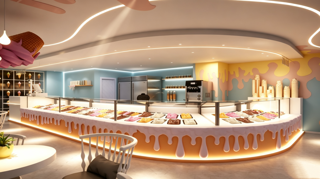
The most impressive part is the bottom design of the cabinet. Instead of a standard flat surface, they made it look like dripping ice cream. The white “dripping” shape, paired with the warm glowing light strip at the bottom, makes it look as if the ice cream is melting slightly. This detail isn’t very expensive (usually made of acrylic or GRG fiberglass), but the psychological impact is huge. It gives customers the impression that “the ice cream is fresh and melting,” which instinctively speeds up their ordering action.
Ceiling and Lighting: Lines and vibes are what matter
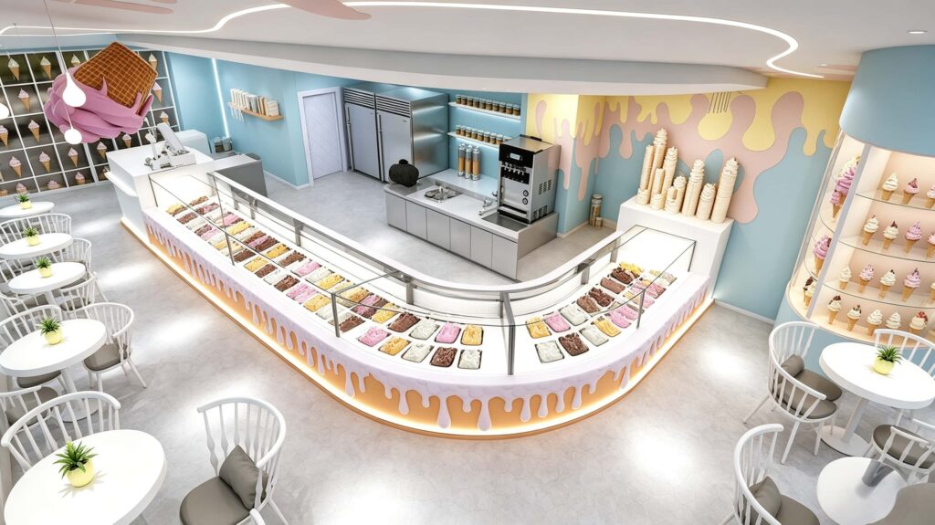
Pay attention to the ceiling, which features a wavy LED strip that looks like cream. This kind of linear lighting doesn’t feel as “rigid” as traditional recessed ceiling lights. It creates a flowing visual effect, making the whole store look more dynamic.
The color temperature of the lights is very mild, mainly using warm white (around 3000K – 3500K). This color temperature makes the colors of the ice cream look more appetizing. Cold white light can make ice cream look like frozen blocks, while warm light brings out the creamy texture. Also, the focused spotlights hit the product directly in the display cabinet, drawing the customer’s attention to “which flavor should I pick.”
Color Psychology: Macaron tones aren’t just about being pretty
The walls are mostly painted in light sky blue, creamy yellow, and peach pink. These low-saturation macaron colors don’t easily cause visual fatigue. When customers stay in a soft environment like this for longer, they feel comfortable and relaxed. Naturally, they’re willing to sit a little longer and order a little more.
There is also a specific ratio in the color palette. Blue serves as the base (calm, clean), while yellow and pink serve as accents (lively, appetizing). This combination ensures the shop looks clean and hygienic, while still maintaining the cozy warmth suitable for a dessert shop.
From a B2B Perspective: What Operational Pain Points Does This Design Solve?
Zoom out and look at the commercial operational value of this design.
Layout Rationality of Flow Lines and Workstations
Many 3D renderings only focus on “looking good” and don’t care how the owner actually runs the business. But look at the back kitchen area in these pictures. The design here is extremely pragmatic.
The soft serve machine, refrigerators, sink, and prep shelves are all concentrated in one U-shaped work area. Employees can reach all ingredients by just turning around. Two or three people working in this space won’t bump into each other. This is about solving “serving efficiency.” If the flow line behind the counter is messy, even if customers are lined up out the door, you won’t be able to serve them quickly, which directly affects your table turnover rate.
Using Soft Decor to Lower Hard Decoration Costs
To be honest, hard decoration can be really expensive. The smart part about this shop’s design is that it allocates the budget to the right places:
- The walls don’t use complex wooden structures. They rely solely on paint and custom wall stickers (those melting cream patterns). This saves at least 40% of material costs compared to using wood veneer.
- The giant hanging cone is made of lightweight materials like expanded foam or fiberglass. It’s light, easy to install, and doesn’t require heavy steel supports.
- The furniture consists of standardized round white tables paired with Windsor chairs. If a chair breaks, you can replace just that one, unlike built-in sofas where you have to replace the whole thing if one spot gets damaged.
Commercial Efficiency and Modular Construction Guidance
The curved counter might look strange, but functionally, it’s made of prefabricated parts assembled on-site. The benefit of this modular approach is that the construction period is very short. You can finish the fit-out in about two weeks. For any business, “opening one day earlier means making money one day earlier.”
I’ve created a table to break down, from the operator’s perspective, the real business benefits that this design brings:
| Design Module | Key Features | Business Value & Data Estimates |
|---|---|---|
| Curved Glass Display Counter | Melting design base + LED ambient lighting | Increases product display area by about 15%. Zero visual blind spots. Boosts ordering rates by approx. 20%. |
| Wave LED Ceiling | Full curved light design, 3000K warm color | Extends customer dwell time by 20-30 seconds. Soft lighting directly enhances the appeal of dessert colors. |
| Wall Drip Decorations | Low-saturation pink, yellow, blue paint + custom wall stickers | Costs only 60% of wood veneer. But huge boost to brand recognition. Easy to replicate for chain stores. |
| Standardized Table & Chairs | Independent round tables + white Windsor chairs | High table turnover rate. Individual chairs can be replaced separately, reducing long-term maintenance costs. |
| U-Shaped Back Kitchen | Compact operation area with soft serve machine, sink, fridge | Optimizes employee flow lines. Improves serving efficiency by about 25%, ensuring smooth operations during peak hours. |
Why Is This Design So Suitable for Overseas Markets?
If your target market is in shopping malls in North America, Europe, or Southeast Asia, this design strategy is very hot right now. Overseas customers really value the “atmosphere and experience” of a store. They won’t travel far just for a cone; they want a comfortable place to sit down and post photos on Instagram or TikTok.
The “check-in” elements in these pictures—like the hanging giant ice cream and the dripping cream wall—are naturally viral content for social media. The social aspect of the design brings your shop free traffic, which is way more cost-effective than paying for ads.
Also, shopping malls abroad have very strict hygiene inspections for food shops. Using mostly glass, stone countertops, and stainless steel kitchen materials in this design makes cleaning incredibly easy. These smooth surfaces don’t hide dirt, perfectly matching the commercial store standards required for export operations.
Conclusion: Rather than just being an “Internet Celebrity,” be a “Practical Celebrity”
Let’s return to the initial question: How to make your ice cream shop unique? My answer is: “Visual dominance supported by operational practicality.”
You use creative designs like the “melting ice cream” to grab eyeballs, but you use a scientific flow layout and durable materials to secure the daily revenue. In this case, there is no overdesigned clutter—just pure commercial design that directly helps the owner make money. If you want to build a store that looks classy and brings in steady profits over the long term, starting with a plan like this is certainly a very reliable path.
Are you ready to decorate your ice cream shop?
Our professional design team and production department can provide you with a one-stop service, helping you avoid many troubles. Please feel free to contact us at any time.