
How to Decorate a Candy Shop | 8 Easy Steps

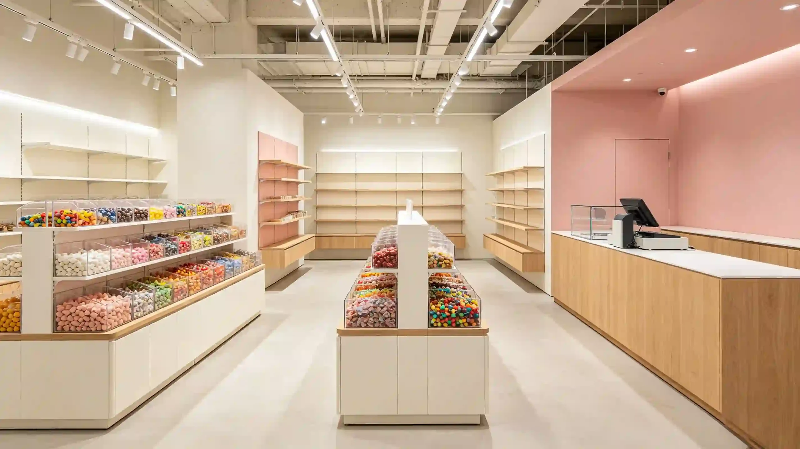
Thinking about decorating a candy shop? Don’t just slap on some pink paint, line up a few candy jars, and call it a day. I’ve helped remodel candy stores in North America, and I’ve seen so many owners pour money in — only to have foot traffic choked by a dead-end layout, dim lighting, and shelf heights that just don’t work. This How to decorate a candy shop guide breaks it down into 8 practical steps. I’ll share a hidden B2B money-saving trick most shop owners have zero clue about — suppliers can cover a big chunk of your fixture costs.
Step 1: Don’t rush into picking wallpaper — give your candy shop a personality first
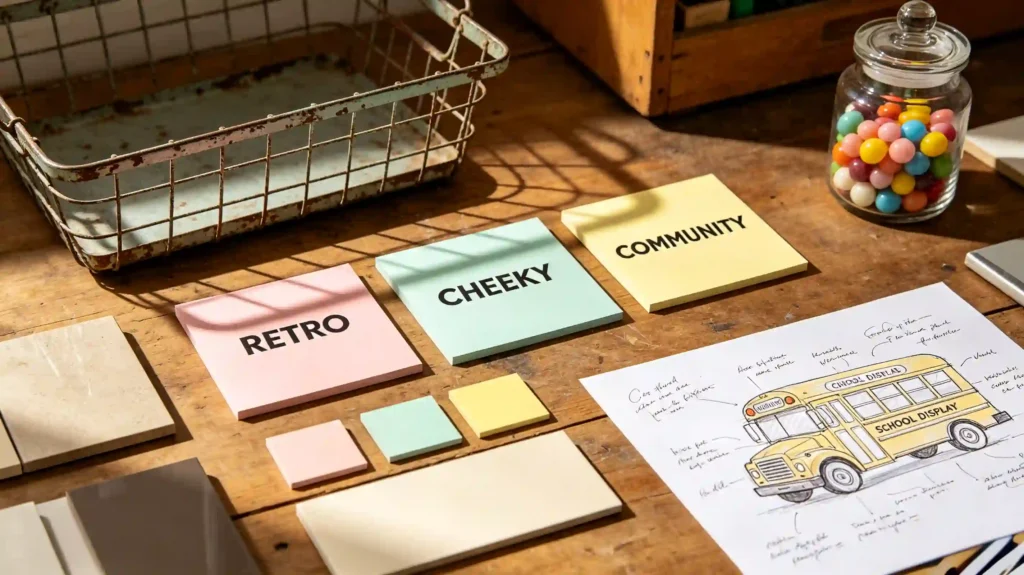
The biggest mistake is copying Pinterest and ending up with the same pink bubble everyone else has. You’ve got to figure out first: Is your shop selling 5-cent nostalgic candy, or high-end artisan chocolate? Are you targeting kids, or young adults who’ll pay extra for something Instagram-worthy?
Here’s a simple positioning trick: lock down three words that define your brand’s personality. Something like “retro, cheeky, community” or “minimalist, giftable, not-too-sweet”. Then run every color, material, and prop through that filter. I once saw a shop that wanted to nail “cheeky”, so they turned an old school bus into a candy display. Cost wasn’t crazy, but now everybody stops to take a photo.
Step 2: Don’t guess the traffic flow — let customers walk through every inch without realizing it
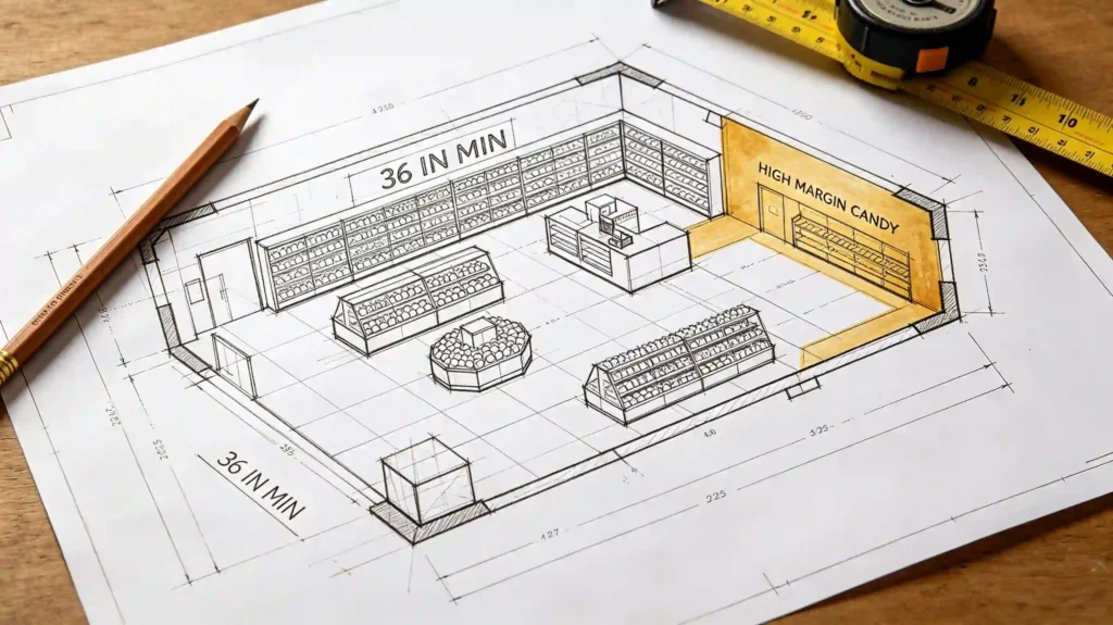
A classic mess: a crowd jammed at the door, and the back of the store totally empty. Usually it’s because there’s no buffer zone at the entrance, or the main aisle gets cut off by a big floor display.
In real life, keep your main aisle at least 36 inches wide (about 91 cm). That meets ADA requirements in the U.S., and it’s also just enough for two people to pass each other without feeling cramped. A candy shop hates feeling packed but without sales. Put your high-margin or novelty candies at the “golden sightline” on the right side of the path — most people instinctively look right when they walk in. Don’t push bulk candy bins flat against the front wall. Pull them out a bit to naturally create a loop. We tested this for one store: just moved one island fixture, and the average time customers spent inside jumped from 3 minutes to 7.
Step 3: Lighting is an invisible salesperson — pick the wrong color temperature and your candy loses its true colors
Candy’s own colors are the best decoration. But if your lighting has a low CRI, purple looks grey and pink looks dirty. Hard rule for a candy shop: CRI > 90, ideally 95. Keep the color temperature between 2700K and 3000K, a warm light that makes candy colors pop and people’s skin look soft — they’ll stick around longer.
Don’t just blast track lights everywhere. Do layers. Use track lights for basic ambient lighting, then add focused accent lights on the bulk candy section and those impulse-buy little shelves near the register. A shop owner who spent $1,500 upgrading the lights told me, right after the switch, the chocolate section’s sales went up 15% that day. Because when the light is right, that silky gloss on the chocolate sells itself.
Step 4: Shelf heights can make or lose one-third of your revenue
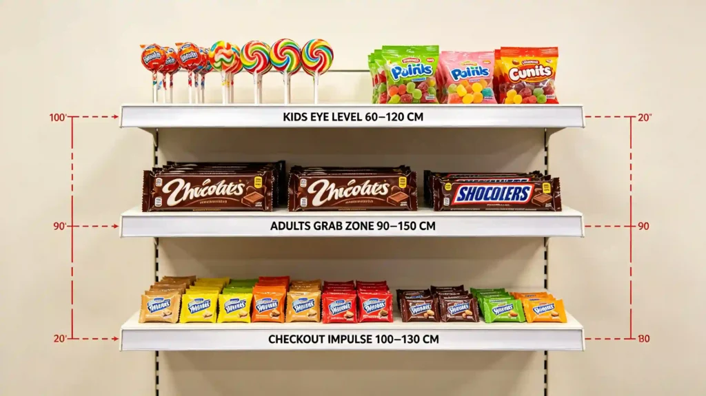
If you want to raise the average ticket, don’t just stuff more products in. Look at the heights first. Here’s the real-world data we tested with shops:
| Customer / Zone | Golden Display Height | Best Candy to Place |
|---|---|---|
| Kids’ eye level | 60 cm – 120 cm (24″ – 47″) | Lollipops, gummies, candy toys |
| Adults’ grab zone | 90 cm – 150 cm (35″ – 59″) | Chocolate bars, gift packs, sugar-free |
| Checkout impulse | 100 cm – 130 cm (39″ – 51″) | Mini packs, limited editions, seasonal |
If families are your main crowd, your whole store needs at least one “low line” below 120 cm — so kids can see and reach by themselves. This isn’t childish; it’s a real way to increase how many times a kid tugs their parent’s sleeve and says “I want that.” Also, don’t use only clear acrylic square jars for display. Mix in some wooden crates and metal baskets. It looks intentional, not messy, and the different textures when picking up candy make people grab just one more handful.
Step 5: Don’t make the color palette too “sweet” — a little restraint actually looks more premium
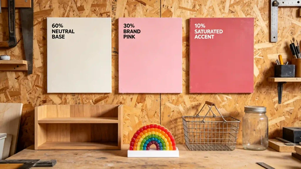
Pink + mint green + lemon yellow, all thrown together without control, just makes a shop feel cheap. A candy shop that really looks classy often follows a ratio: 60% neutral base + 30% brand memory color + 10% high-saturation accent.
For example, do the walls and floor in cream white or light oak. Shelves in matte pink. Then use a neon sign or a row of rainbow gummy jars as that 10% punch. Once you control the visual noise, the candy itself becomes the hero. I once suggested a shop owner swap a bright sky-blue wall for a dustier “frosting white”, paired with natural wood baskets. Their customer base quickly shifted from just parents with kids to include young office workers, and gift sales doubled as a percentage of revenue.
Step 6: Smell and sound are hidden deal-closers
Don’t spend your whole budget on things people can see. The smell of fresh waffle cones, a faint caramel note — it relaxes people and makes them way less price-sensitive. But don’t mix scents like a crazy person. Stick to 1 or 2 clear ones. Don’t turn your shop into a fragrance explosion.
Music matters even more. If you want to sell more bulk candy by weight, play slower-tempo tracks. If you need fast turnover and mainly sell takeaway cups of candy, a quicker beat can work. And watch the noise level: avoid too many hard surfaces that bounce sound around. Use cork boards, fabric curtains, or plants to absorb sound. A quiet, premium feel makes people take their time in the gift section.
Step 7: Design one “must-snap” corner
Free traffic from Instagram and TikTok does more for new customer acquisition than any local ad. You just have to deliberately leave space for a “visual hammer” wall. It’s not just slapping up some angel wings mural. You need to bake your brand’s personality into it. Think a whole wall of gummy bears arranged by color gradient, or a giant fake melting ice cream hanging from the ceiling.
The key: light it really well, leave at least 1.5 meters (5 feet) of standing room right in front for photos, and you can even put a little “best photo spot” sticker on the floor. We tracked one client who put up a store name wall made of rainbow jelly beans. Within two weeks, geo-tagged social media posts went up by 160, and people from the next city drove over just to check it out.
Step 8: Before you order anything, ask suppliers — you can slash your decoration budget big time
This is a classic B2B hidden resource that newbies totally miss. Wholesale candy distributors, ice cream equipment suppliers, even syrup manufacturers — they are sitting on a pile of free or subsidized display fixtures. Branded acrylic stands, glass jars, freezers, even custom storefront lightboxes. They’re often willing to cover part or all of the cost, as long as you give their flagship products a fixed spot in your display.
We once connected with an artisan gummy wholesaler. They straight-up provided nearly $3,000 worth of modular display cabinets, and the shop owner only had to pay for installation and some soft decor around it. So before you finalize your decoration plan, sit down with your top 3 suppliers and simply ask: “What kind of in-store display support programs do you have?” Then draw those free fixtures into your layout early. Not only does this save hard costs, but suppliers will also send you new product launches and seasonal display materials way faster than your competitors get them.
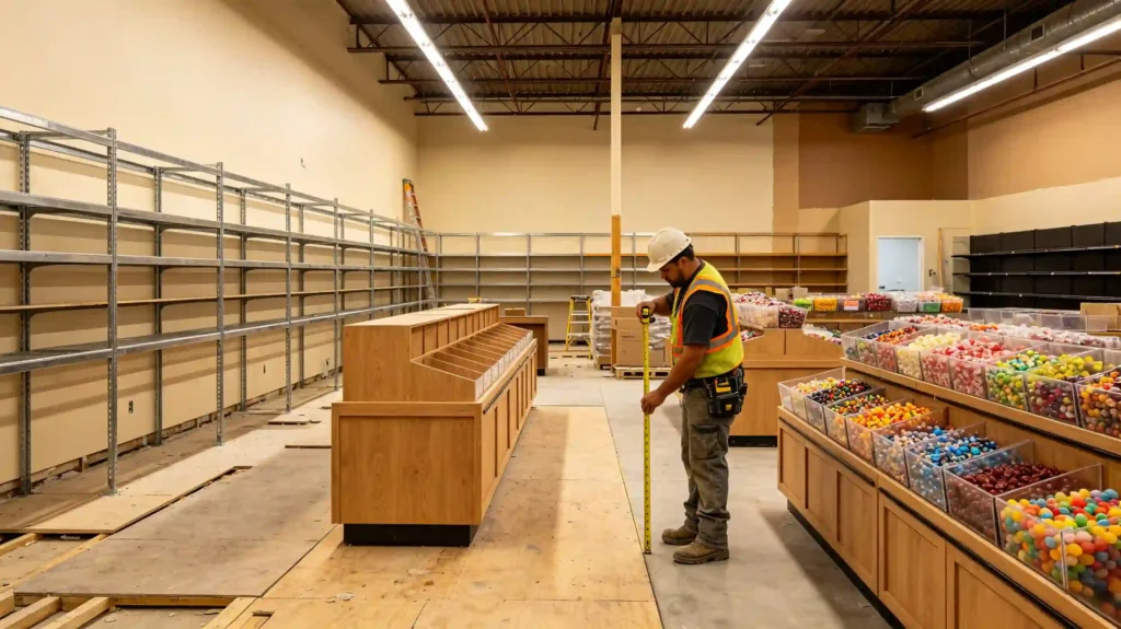
How to split your budget without messing up?
Here’s a decoration budget breakdown I’ve seen work for many shops. It fits a candy retail space of about 50–80 square meters (around 500–850 sq ft):
| Item | Recommended Share | Things People Forget |
|---|---|---|
| Hard finishes & flooring | 30% | Go for slip-resistant material that handles sugar stains, not just pretty looks |
| Shelving & fixtures | 25% | Subtract any free supplier stuff first, then figure out your own budget |
| Lighting system | 15% | Include transformers, tracks, and dimmer switches — don’t cheap out on the bulbs |
| Signage & window display | 12% | The 3-second readability rule: big letters, high contrast |
| Instagram spot & soft decor | 10% | At least one refreshable display that’s easy to swap out seasonally |
| Emergency buffer | 8% | Something custom will come in the wrong size. This money saves your butt |
Decorating a candy shop is not like furnishing a showroom. Every single step needs to push toward one thing: make people walk in, stop, pull out their phone, and open their wallet. Every inch of your space can work as a silent salesperson. Try picking just two steps you can start right now — maybe lower a shelf by 15 cm, or get your supplier to hand you a free display case. That alone can do more for your sales than adding ten new candy varieties.
If you want to decorate your candy store, please feel free to contact us at any time. We will offer you free quotations, catalogs or selection of solutions.